Last Updated on September 20, 2021 by Prabhakar A
It is almost impossible to impress users with a poor user interface. The hamburger menu has been the conventional option for excellent navigation by providing a neat UX. Lately, developers opt for innovative options depending on the digital product’s functionalities. This can be explained by the fact that hamburger menu alternatives do not hide drop-down functions like the traditional option.
If your next move is finding and trying alternatives to the hamburger menu, here is everything you need to know.
Know more: Textsheet Alternative For Students
Table of Contents
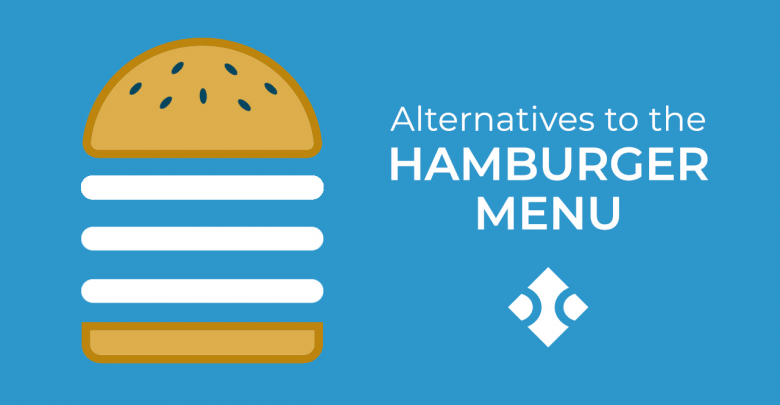
Hamburger Menu Alternatives
1. Tab Bar Navigation
This alternative is perfect if your menu doesn’t have more than five items. Navigating tabs is simple because the function is visible (either on the top or bottom pages). Users can easily spot it, click, and view the section they are looking for. What should you focus on when using this option?
- Visibility
- Activeness –ease of navigation
- You should have a maximum of five sub-items.
- Highlight the menus logically –start with priority (start with the home tab and add the rest). Make sure the functions relate.
The only disadvantage with this option is that users might experience difficulties navigating or miss out on critical tabs if they are disorganized.
2. Tab with the ‘More’ Function
This option is viable if you have more than five subcategories; you will only display four, but the rest are under the ‘more’ function. The fifth icon hides the rest of the subsections; a user should click more to view. This option seems difficult to implement but consider placing essential functions within reach, and you will be good to design. What do you need in this case?
- Include all the primary functions in the first four categories; users rarely click the ‘more’ icon.
- Ensure the buttons are accessible
- List other sections under the fifth bar for quick navigation.
The only downside with this alternative is that users might miss the essential sections if they don’t click on the ‘more’ icon.
Know more: Alternatives for Uber App
3. Progressively collapsing menu
This hamburger alternative is quite sophisticated yet interesting. It appears like the tab with a ‘more’ alternative, only that the progressively collapsing section adjusts to display and fit the screen and leaves other sections under the more icon. Ideally, the progressively collapsing navigation can display ten functions on a PC monitor, seven on a laptop, and three or five on a mobile app. It means that you will view as many categories depending on the screen’s size. If you are looking for a friendly design, you should get a quotation from Fireart Studio for an excellent product. What’s unique about this alternative?
- Users can view as many functions depending on the device they are using.
- It incorporates the best features under the conventional hamburger menu.
- This option is ideal for maintaining the optimal desktop view for an extended period.
4. Scrollable navigation
So, what happens when you are unsure of what functions to prioritize? You should use the scrollable navigation hamburger alternative. This option is ideal where all the categories are almost equitable, allowing the user to decide what to explore first.
See more: Top 10 GoDaddy Alternatives
Websites like news sites, eCommerce stores, and music lists are likely to explore this option as it allows users to scroll through the categories to access what users find important. What should you factor in if you prefer the scrollable navigation option?
- Work on visibility; you can use visual indicators like different fonts, colors, and arrows to compel users to continue scrolling.
5. Full-screen option
Every other navigation alternative minimizes the screen’s size, but the full-screen option does the opposite; it maximizes the space. This alternative is perfect where viewers can access the entire homepage by covering the whole screen. Navigation is straightforward because all the sections and subcategories are within a thumbs reach. You are likely to notice this design in task-based applications and websites. What’s unique about the full-size navigation alternative?
- Visitors pay attention to the areas they want; they decide what to view from the categories and concentrate there.
- Developers have the opportunity to organize information coherently.
The list of hamburger menu alternatives is non-exhaustive; we only included the common ones. Fireart Studio https://fireart.studio/blog/5-smart-alternatives-to-the-hamburger-menu/ has the best web and app development designs; you can contact them for similar services.
Comments
0 comments