Last Updated on February 23, 2026 by Prabhakar A
In today’s fast-paced digital landscape, your website serves as the virtual storefront for your brand. A poorly designed website can lead to frustrated visitors and lost opportunities. Are you confident that your website provides a positive and efficient user experience?
This guide dives deep into practical web design tips that prioritize user experience (UX), ensuring your website not only attracts visitors but also keeps them engaged. We’ll cover key areas, from intuitive navigation to responsive design and content readability, providing actionable steps to enhance your website’s usability and effectiveness.
Table of Contents
Is Your Website Losing Visitors? Prioritize User Experience!
A negative user experience can be a silent killer for your website. Users are impatient and have countless alternatives at their fingertips. If your site is difficult to navigate, slow to load, or simply unattractive, visitors will quickly abandon it for a competitor’s. Understanding the common UX issues and catering to user expectations is paramount to retaining visitors and achieving your website’s goals.
Common UX Issues Driving Users Away
Several factors can contribute to a poor user experience. Slow loading speeds are a major culprit; users expect near-instantaneous results. Complex or confusing navigation makes it difficult for visitors to find what they’re looking for. A cluttered or visually overwhelming design can be distracting and off-putting. Poor mobile optimization results in a frustrating experience for the growing number of mobile users. Finally, outdated or irrelevant content can signal to users that your website is not a reliable source of information. Addressing these issues directly can lead to significant improvements in user engagement.
Understanding User Expectations in 2026
User expectations are constantly evolving. In 2026, users expect websites to be fast, responsive, secure, and personalized. They want to easily find information through intuitive navigation and clear calls to action. Accessibility is also crucial; websites should be usable by people with disabilities. Users also expect a seamless experience across all devices, from desktops to smartphones and tablets. A failure to meet these expectations can lead to high bounce rates and lost opportunities.
The ROI of a User-Friendly Website
Investing in user experience offers a significant return on investment. A user-friendly website can lead to increased engagement, higher conversion rates, improved search engine rankings, and greater brand loyalty. When users can easily find what they’re looking for and have a positive experience on your site, they’re more likely to convert into customers or achieve the desired action, such as signing up for a newsletter or requesting a quote. Moreover, a positive UX encourages repeat visits and positive word-of-mouth referrals, further boosting your website’s success. Consider exploring content marketing and SEO strategies to help increase conversions and engagement with helpful resources such as “Content Marketing ROI: A Business Owner’s AI Guide”.
Intuitive Navigation: The Key to a Seamless User Journey

Website navigation is the roadmap that guides visitors through your site. A well-designed navigation system should be intuitive, clear, and efficient, allowing users to quickly and easily find the information they need. Confusing or poorly structured navigation can lead to frustration and abandonment. Think of your website as a physical store: effective navigation is like clear signage and well-organized aisles, guiding customers to the products they want.
Implementing Clear and Concise Menus
Your website’s menu should be the primary means of navigation. Keep it simple and concise, using clear and descriptive labels for each menu item. Avoid jargon or technical terms that might confuse visitors. Limit the number of menu items to avoid overwhelming users. Use dropdown menus sparingly and only when necessary to organize a large amount of content. Ensure that the menu is consistently placed and visible on every page of your website. Prioritize the most important pages or sections of your website in the main menu. For example, Trainingsadda.in features categories like Education, Business, Digital Marketing, and Technology in the main menu, making it easy for users to find relevant content.
Optimizing Site Search Functionality
Site search is an essential tool for users who know exactly what they’re looking for. Ensure that your website has a prominent and easily accessible search bar. Use a powerful search engine that can accurately match search queries with relevant content. Implement features like autocomplete and suggested searches to help users refine their searches. Display search results in a clear and organized manner, highlighting the most relevant results. Consider adding filters and sorting options to allow users to further refine their search results. Regularly analyze search queries to identify gaps in your content and improve your website’s search functionality.
Breadcrumb Navigation: A Helpful Aid
Breadcrumb navigation provides users with a visual representation of their location within your website’s hierarchy. It helps them understand where they are in relation to the homepage and other sections of the site. Breadcrumbs are particularly useful for websites with complex or deep content structures. They allow users to easily navigate back to previous pages or sections without having to use the browser’s back button. Implement breadcrumbs in a consistent and visually unobtrusive manner. Use clear and descriptive labels for each breadcrumb. Consider making the last breadcrumb non-clickable to indicate the current page.
Responsive Design: A Must-Have for All Devices
In today’s mobile-first world, responsive design is no longer optional – it’s a necessity. Responsive design ensures that your website adapts seamlessly to different screen sizes and devices, providing a consistent and optimal user experience regardless of whether users are browsing on a desktop computer, a tablet, or a smartphone. A non-responsive website can lead to frustrated users who struggle to view content, navigate menus, or fill out forms on their mobile devices. This is especially important if your site caters to users seeking educational and career advice, like “The Ultimate Guide to Effective Career Planning”.
Testing Your Website on Different Screen Sizes
The best way to ensure that your website is truly responsive is to test it on a variety of screen sizes and devices. Use browser developer tools to simulate different screen resolutions. Test your website on physical devices, including smartphones and tablets of different sizes. Pay attention to how the layout, images, and text adapt to each screen size. Identify and fix any issues that arise, such as overlapping elements, broken images, or unreadable text. Consider using a responsive design testing tool to automate the testing process. Regularly re-test your website as you make changes to ensure that it remains responsive.
Using Flexible Images and Grids
Flexible images and grids are essential components of responsive design. Flexible images automatically resize to fit the available screen space, preventing them from overflowing their containers or becoming pixelated. Use the `max-width: 100%;` CSS property to make images responsive. Flexible grids allow you to create layouts that adapt to different screen sizes. Use CSS grid or flexbox to create flexible grids. Avoid using fixed-width layouts, as they will not adapt well to different screen sizes. Consider using media queries to adjust the layout and styling of your website based on the screen size.
Mobile-First Indexing and SEO Considerations
Google uses mobile-first indexing, which means that it primarily uses the mobile version of a website for indexing and ranking. This makes responsive design even more critical for SEO. Ensure that your mobile website has the same content and functionality as your desktop website. Optimize your mobile website for speed, as mobile users are particularly sensitive to slow loading times. Use a mobile-friendly testing tool to identify and fix any mobile SEO issues. Consider using Accelerated Mobile Pages (AMP) to further improve the performance of your mobile website. Make sure your site is discoverable for users browsing on mobile devices. Failure to optimize your website for mobile devices can negatively impact your search engine rankings.
Content Readability: Making Information Accessible
Even the most beautifully designed website will fail if its content is difficult to read. Content readability refers to the ease with which users can understand and process the information presented on your website. Factors such as font choice, font size, line height, and paragraph length all contribute to readability. Prioritizing content readability ensures that your message is effectively conveyed and that users can easily engage with your content.
Choosing the Right Fonts and Font Sizes
The font you choose can significantly impact the readability of your website. Select fonts that are clear, legible, and easy to read on screen. Avoid overly decorative or stylized fonts. Use a font size that is large enough to be easily read without straining the eyes. A font size of 16px or larger is generally recommended for body text. Use different font sizes for headings and subheadings to create visual hierarchy. Consider using a sans-serif font for body text and a serif font for headings, or vice versa. Test your font choices on different devices and browsers to ensure that they render correctly.
Using Headings, Subheadings, and Bullet Points
Headings, subheadings, and bullet points are essential tools for organizing and structuring your content. Headings and subheadings create a clear visual hierarchy, making it easy for users to scan and understand the main points of your content. Use descriptive and concise headings and subheadings that accurately reflect the content of each section. Bullet points break up long blocks of text and make information easier to digest. Use bullet points to list items, highlight key points, or present step-by-step instructions. These strategies are especially effective for career advice content, as seen in sites similar to Trainingsadda.in offering “Ultimate Career Guide: Finding Your Dream Job.”
Optimizing Line Height and Paragraph Length for Easy Reading
Line height and paragraph length can significantly impact the readability of your content. Use an appropriate line height to create sufficient spacing between lines of text. A line height of 1.5 to 2 is generally recommended for body text. Avoid using overly long or short paragraphs. Break up long paragraphs into smaller, more manageable chunks. Keep paragraphs focused on a single idea or topic. Use white space to create visual separation between paragraphs. These optimization techniques will help users read and understand your content more easily and retain more information.
Page Load Speed: Keeping Users Engaged
Page load speed is a crucial factor in user experience and website success. A slow-loading website can frustrate users, leading to higher bounce rates and lower conversion rates. Studies have shown that users expect a website to load in under three seconds, and a delay of even a few seconds can significantly impact user satisfaction and revenue. Therefore, optimizing your website for speed is not just a technical task, but a strategic business decision.
Decision Criteria for Prioritizing Page Speed Optimization: Consider factors such as your target audience’s internet speeds, the complexity of your website’s design, and the volume of traffic your website receives. If you are targeting users in areas with limited internet access, or if your website is heavily reliant on rich media, prioritizing page speed optimization becomes even more critical.
Pitfalls to Avoid: Neglecting image optimization, using excessive plugins, and relying on outdated code are common pitfalls that can negatively impact page load speed. Overloading your website with unnecessary elements can quickly degrade performance, even with a powerful hosting server.
Optimizing Images for the Web
Images are often the largest files on a web page, so optimizing them is essential for improving page load speed. This involves compressing images without sacrificing quality, choosing the right file format (JPEG for photos, PNG for graphics), and resizing images to the appropriate dimensions. Tools like TinyPNG and ImageOptim can help you automatically compress images. Use the <picture> element or the srcset attribute within the <img> tag to serve different image sizes based on the user’s screen size, further optimizing performance.
Leveraging Browser Caching
Browser caching allows users’ browsers to store static assets like images, CSS files, and JavaScript files locally. This means that on subsequent visits to your website, the browser can load these assets from its cache instead of downloading them again from the server, significantly speeding up page load times. Configure your server to set appropriate cache headers, specifying how long browsers should cache these assets. This is typically done through your .htaccess file (for Apache servers) or server configuration files. Aim for a balance – cache frequently updated content for shorter periods and static content for longer periods. Caching can even extend to API requests by caching the returned data.
Minifying CSS and JavaScript Files
Minifying CSS and JavaScript files removes unnecessary characters, such as whitespace, comments, and line breaks, from the code. This reduces the file size, making it faster to download and parse. Tools like UglifyJS and CSSNano can automate this process. Combine multiple CSS and JavaScript files into fewer files to reduce the number of HTTP requests required to load the page. Some build tools, like Webpack or Parcel, can automate the minification and concatenation process as part of your deployment workflow. When choosing a tool, consider support, ease of integration and automation, and community support.
Choosing a Reliable Hosting Provider
Your hosting provider plays a significant role in website performance. A reliable hosting provider will have fast servers, ample bandwidth, and robust infrastructure. Consider factors like server location (choose a server close to your target audience), server type (shared, VPS, or dedicated), and uptime guarantees when selecting a hosting provider. Look for providers that offer features like SSD storage, caching mechanisms, and content delivery networks (CDNs). Always read reviews and compare pricing plans to ensure you’re getting the best value for your needs.
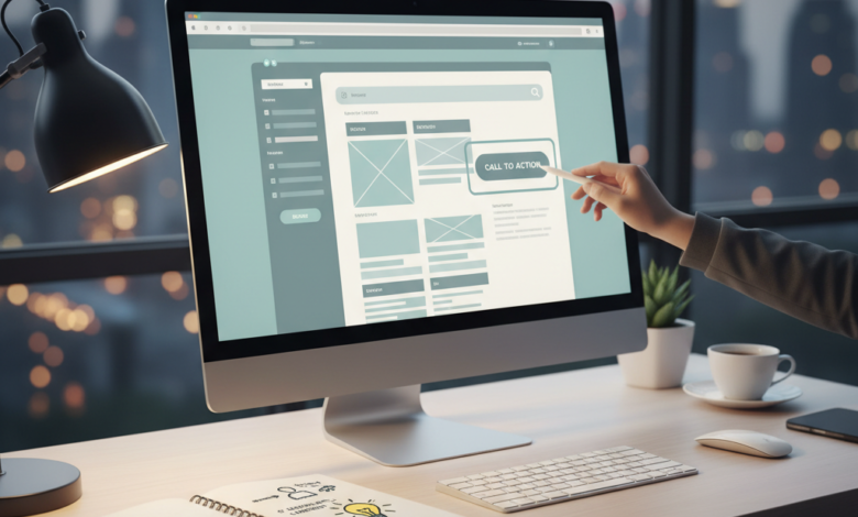
Effective Calls to Action (CTAs): Guiding Users to Conversion
Calls to action (CTAs) are essential elements that guide users toward desired actions, such as making a purchase, signing up for a newsletter, or contacting your business. Well-designed CTAs can significantly increase conversion rates and improve the overall user experience. A CTA should clearly state the desired action and stand out visually from the surrounding content. Think of them as signposts, clearly directing users to their next step.
Decision Criteria for Choosing Appropriate CTAs: CTAs should align with the user’s intent and the stage of the customer journey. For example, a user on a product page might be presented with a “Add to Cart” CTA, while a user on the homepage might see a “Learn More” or “Get Started” button. Consider the overall marketing funnel and tailor your CTAs accordingly.
Pitfalls to Avoid: Using generic CTAs like “Submit” or “Click Here,” having too many CTAs on a page, or placing CTAs in obscure locations are common mistakes. Overwhelming users with choices can lead to analysis paralysis and decreased conversions. Always test different CTAs to see what resonates best with your audience.
Strategic Placement of CTAs
The placement of CTAs is crucial for their effectiveness. Place CTAs in prominent locations where they are easily visible, such as above the fold, within content sections, and at the end of blog posts. Consider using A/B testing to determine the optimal placement for your CTAs. For example, a “Sign Up” CTA might perform better in the header of your website, while a “Learn More” CTA might be more effective after a brief product description. Context is key.
Using Action-Oriented Language
Use clear, concise, and action-oriented language in your CTAs. Instead of using generic phrases like “Submit,” use specific phrases like “Download Now,” “Get Your Free Trial,” or “Start Saving Today.” Use verbs that clearly indicate the action you want users to take. Personalize CTAs based on user data or behavior to make them more relevant and engaging. For instance, a clothing website could use a CTA that says “Shop Women’s Summer Collection” based on the user’s past purchase history.
Designing Visually Appealing CTAs
CTAs should be visually appealing and stand out from the surrounding content. Use contrasting colors, clear typography, and sufficient whitespace to make your CTAs noticeable. Ensure that your CTAs are mobile-friendly and easy to tap on touchscreens. Use visual cues like arrows or icons to further emphasize the call to action. The size and shape of the CTA also play a role in its visibility; experiment with different designs to find what works best for your audience. According to “Boost Conversions: Elementor Landing Page Design Secrets” ( https://blog.copyelement.com/boost-conversions-elementor-landing-page-design-secrets/ ) strategic use of color and contrast can boost conversions.
Accessibility: Ensuring Inclusivity for All Users
Website accessibility is the practice of designing and developing websites that are usable by people with disabilities. This includes people with visual, auditory, motor, and cognitive impairments. Creating an accessible website not only benefits users with disabilities but also improves the overall user experience for everyone. It’s also becoming an increasingly important legal and ethical consideration. Ignoring accessibility can lead to negative consequences, including lawsuits and reputational damage.
Decision Criteria for Implementing Accessibility Features: Consider the diversity of your target audience and the types of disabilities that may affect their ability to use your website. Prioritize accessibility features based on their impact on usability and their ease of implementation. Regularly test your website with assistive technologies to identify and address any accessibility issues.
Pitfalls to Avoid: Ignoring accessibility guidelines, relying solely on automated accessibility tools, and failing to involve users with disabilities in the testing process are common mistakes. Remember that accessibility is an ongoing process, not a one-time fix.
Following WCAG Guidelines
The Web Content Accessibility Guidelines (WCAG) are a set of internationally recognized guidelines for making web content more accessible. WCAG provides specific success criteria that web developers and designers can use to ensure their websites are accessible. These guidelines cover a wide range of accessibility issues, including providing alternative text for images, ensuring sufficient color contrast, and making websites navigable using a keyboard. Regularly review and update your website to comply with the latest WCAG standards.
Providing Alternative Text for Images
Alternative text (alt text) is a short description of an image that is displayed if the image cannot be loaded or if a user is using a screen reader. Alt text helps users understand the content of the image even if they cannot see it. Write descriptive and concise alt text that accurately reflects the content of the image. Avoid using generic phrases like “image” or “picture.” For purely decorative images, use an empty alt attribute (alt="") to signal to screen readers that the image should be ignored.
Ensuring Keyboard Navigation
Many users with motor impairments rely on keyboard navigation to use websites. Ensure that all interactive elements on your website, such as links, buttons, and form fields, are accessible using the keyboard. Use the tabindex attribute to control the order in which elements are focused. Provide visual cues to indicate which element is currently focused. Avoid using JavaScript that disables or interferes with keyboard navigation.
Visual Hierarchy: Directing the User’s Eye
Visual hierarchy refers to the arrangement of elements on a web page in a way that guides the user’s eye and highlights the most important information. By establishing a clear visual hierarchy, you can help users quickly understand the content and navigate the page effectively. This involves using various design techniques, such as size, color, contrast, and whitespace, to create a sense of order and importance.
Decision Criteria for Establishing Visual Hierarchy: Identify the key goals of your website and the most important information you want users to see. Prioritize these elements visually by making them larger, bolder, or more prominent than less important elements. Consider the user’s scanning patterns and place important elements where they are most likely to be seen.
Pitfalls to Avoid: Overloading the page with too many competing elements, using inconsistent visual cues, and neglecting whitespace are common mistakes that can disrupt visual hierarchy. Ensure that there is a clear and logical flow to the page, guiding the user’s eye through the content in a natural way.
Using Size, Color, and Contrast to Create Visual Interest
Size, color, and contrast are powerful tools for creating visual interest and establishing visual hierarchy. Use larger font sizes for headings and important text to make them stand out. Use contrasting colors to highlight key elements, such as buttons and links. Ensure that there is sufficient color contrast between text and background to improve readability. Be mindful of colorblindness and ensure that important information is not conveyed solely through color. For example, the Trainingsadda.in site could use a larger font for article titles and a contrasting color for internal links like “Boost Your Business: A Guide to Lean Principles”.
Strategic Use of White Space
White space, also known as negative space, is the empty area around elements on a page. It helps to separate elements, improve readability, and create a sense of balance. Use whitespace generously to give the eye a rest and prevent the page from feeling cluttered. Increase the whitespace around important elements to draw attention to them. White space is an essential tool for creating a clean and professional design.
Importance of a Focal Point
A focal point is the most visually dominant element on a page, designed to capture the user’s attention immediately. It could be a large image, a headline, or a call to action. Use a focal point to guide the user’s eye and convey the most important message of the page. Ensure that the focal point is relevant to the content and aligns with the overall goals of the website. By creating a clear focal point, you can help users quickly understand the purpose of the page and engage with the content more effectively. Consider user eye-tracking studies when choosing and positioning the focal point, ensuring it aligns with natural viewing patterns.
Minimize Distractions: Focus on Core Content
A cluttered website overwhelms users and detracts from your key message. Prioritize a clean and focused design. Decision criteria for evaluating distractions should include: bounce rate on specific pages, time spent on core content pages versus ancillary pages, and user feedback gathered through surveys or usability testing. A pitfall to avoid is adding elements simply because they are trendy, without considering their impact on user experience. Always ask: Does this element contribute to the user’s goal on this page?
Avoiding Excessive Pop-ups and Ads
Pop-ups and intrusive ads are a major source of frustration for users. Limit their use to essential situations, such as collecting email addresses or announcing critical updates. Even then, ensure they are easy to dismiss and don’t interrupt the user’s workflow. Implement these pop-ups strategically: delay them until after the user has spent a reasonable amount of time on the page or offer them upon exit intent. An example is a user browsing for job opportunities on Trainingsadda.in. A pop-up appearing immediately asking for their email address would be disruptive. However, a pop-up offering a free career planning guide after they’ve viewed several job postings might be welcomed. Consider using less intrusive alternatives like banners or embedded forms. Excessive ads distract from content and damage credibility. Strive for a balance between monetization and user experience.
Limiting Animation and Auto-playing Audio/Video
Animation and auto-playing media can be visually appealing, but they can also be incredibly distracting. Use animation sparingly to draw attention to key elements or guide users through a process. Avoid excessive animation that serves no functional purpose. Auto-playing audio and video are almost universally disliked. They interrupt the user’s focus and can be embarrassing if the user is in a public place. Always give users control over media playback. Actionable steps include: Auditing your website for unnecessary animations, testing the impact of animations on page load speed, and ensuring all audio and video content requires user interaction to play. The Nielsen Norman Group offers extensive research on the usability of animation.
Streamlining the User Interface
A complex user interface (UI) confuses users and makes it difficult to find what they need. Simplify your UI by reducing the number of options and making navigation intuitive. Use clear and concise labels, and group related elements together logically. Employ visual hierarchy to guide the user’s eye to the most important information. Remove any unnecessary clutter or visual noise. For instance, if Trainingsadda.in has too many categories listed in the main navigation, consider consolidating them under broader headings. Use whitespace effectively to create visual breathing room and improve readability. Test different UI layouts with real users to identify areas for improvement. Consider adopting a minimalist design approach, focusing on essential elements and removing anything that doesn’t contribute to the user’s experience. Partner resources like Boost Conversions: Elementor Landing Page Design Secrets can provide additional insight on streamlined design.
Regular User Testing: Gathering Feedback and Making Improvements
User testing is crucial for identifying usability issues and ensuring your website meets the needs of your target audience. Don’t assume you know what users want. Conduct regular user testing to gather feedback and make informed design decisions. This iterative process allows you to refine your website over time, based on real-world usage data. The key to successful user testing lies in defining clear objectives, recruiting representative users, and analyzing the results objectively. Ignoring user feedback is a common pitfall that leads to a frustrating user experience. Regularly analyze what your users do on your website to understand their experience. Consider tools that provide heatmaps, session recordings, and conversion funnels for insightful analysis.
Conducting Usability Tests
Usability tests involve observing real users as they interact with your website. Task them with completing specific tasks, such as finding a particular piece of information or filling out a form. Observe their behavior and note any difficulties they encounter. Ask them to think aloud as they navigate the site, providing valuable insights into their thought process. Record the sessions so you can review them later. Recruit a diverse group of participants to ensure you get a range of perspectives. Usability tests can be conducted in person or remotely using screen-sharing software. Remote testing is often more cost-effective and allows you to reach a wider audience. Always provide clear instructions and a comfortable testing environment. Ensure participants are representative of your target audience. A sample size of 5-8 users per test is often sufficient to identify most usability issues. For example, asking users of Trainingsadda.in to locate the “Ultimate Career Guide: Finding Your Dream Job” through navigation can uncover issues.
Analyzing Website Analytics
Website analytics tools provide valuable data about how users interact with your website. Track metrics such as page views, bounce rate, time on site, and conversion rates. Analyze this data to identify areas where users are struggling or dropping off. Use analytics to understand user behavior and identify trends. Set up goals and funnels to track key conversions, such as form submissions or purchases. A sudden drop in conversions might indicate a problem with your checkout process or a broken link. Use A/B testing to experiment with different design elements and see which ones perform best. For instance, analyze the effectiveness of the “Boost Your Business: A Guide to Lean Principles” article on Trainingsadda.in by monitoring its page views and time on site, which indicates user engagement. Google Analytics is a widely used and powerful tool for website analytics.
A/B Testing Different Design Elements
A/B testing involves creating two versions of a webpage (A and B) and showing each version to a different group of users. Track the performance of each version to see which one performs better. A/B testing allows you to make data-driven design decisions and optimize your website for maximum effectiveness. Test different headlines, calls to action, images, and layouts. Only test one element at a time to ensure you can isolate the impact of each change. Use a statistically significant sample size to ensure your results are reliable. A/B testing is a continuous process. Constantly experiment with new ideas and refine your website based on the results. For example, on Trainingsadda.in, you could A/B test different button colors for the “Enroll Now” button on a course description page to see which color leads to higher conversion rates. If you test multiple elements at once it becomes harder to attribute the changes to one specific cause.
Security First: Protecting User Data and Building Trust
In today’s digital landscape, website security is paramount. Protecting user data is not only a legal requirement but also essential for building trust and maintaining a positive reputation. A security breach can have devastating consequences, including financial losses, reputational damage, and legal liabilities. Implement robust security measures to protect your website from cyber threats. Regularly update your software and plugins, and use strong passwords. Educate your team about security best practices and conduct regular security audits. Transparency in your security practices is also vital. Clearly communicate your security measures to users and be upfront about any potential risks. User trust is hard-earned and easily lost. Prioritize security to protect your users and your business.
Implementing SSL Encryption (HTTPS)
SSL encryption (HTTPS) is a fundamental security measure that protects data transmitted between your website and users’ browsers. It encrypts sensitive information such as passwords, credit card numbers, and personal details, preventing eavesdropping and data theft. SSL encryption is essential for any website that collects user data. Most web hosting providers offer SSL certificates. Install an SSL certificate on your website and ensure that all pages are served over HTTPS. Verify your SSL certificate regularly to ensure it is up-to-date. Browsers display a padlock icon in the address bar to indicate that a website is using HTTPS. This visual cue reassures users that their data is protected. Google also prioritizes HTTPS websites in search rankings. Not having SSL encryption can hurt your SEO and your users’ trust.
Staying Up-to-Date with Security Patches
Software vulnerabilities are a common target for cyberattacks. Regularly update your website’s software, including your content management system (CMS), plugins, and themes, to patch security vulnerabilities. Enable automatic updates whenever possible. Subscribe to security alerts from your software vendors and security organizations. Promptly install security patches as soon as they are released. Ignoring security updates is a major security risk. Hackers often target websites with known vulnerabilities. Implement a system for tracking and applying security patches. Regularly scan your website for malware and other security threats. Consider using a web application firewall (WAF) to protect your website from common attacks.
Clearly Communicating Your Privacy Policy
Your privacy policy outlines how you collect, use, and protect user data. Clearly communicate your privacy policy to users in a concise and easy-to-understand manner. Be transparent about what data you collect, why you collect it, and how you use it. Provide users with options to control their data, such as opting out of marketing emails or deleting their accounts. Ensure your privacy policy complies with all applicable laws and regulations, such as GDPR and CCPA. Regularly review and update your privacy policy to reflect any changes in your data practices. Make your privacy policy easily accessible on your website, typically in the footer. Building trust through transparency is critical for maintaining user loyalty. It also demonstrates a commitment to ethical data handling, which consumers increasingly value.
In conclusion, building a user-friendly website is a continuous process that requires careful planning, user feedback, and a commitment to security. By minimizing distractions, prioritizing usability, and protecting user data, you can create a website that provides a positive and engaging experience for your visitors.
Comments
0 comments