Last Updated on March 12, 2026 by Prabhakar A
In today’s fiercely competitive digital landscape, a generic website homepage simply doesn’t cut it. To truly capture leads and drive conversions, you need meticulously crafted landing pages that speak directly to your target audience and guide them towards a specific action. Think of your landing page as a highly focused salesperson, dedicated to closing the deal. This guide will provide you with a step-by-step approach to optimizing your landing pages, ensuring they are not only visually appealing but also strategically designed to maximize conversions.
We’ll dive deep into understanding your audience, crafting compelling headlines, designing for optimal user experience, and leveraging the power of A/B testing. Mastering these techniques will help you transform casual visitors into loyal customers and unlock the true potential of your marketing efforts.
Table of Contents
Stop Wasting Ad Spend: Turn Landing Page Visitors into Customers (Updated for 2026)
The Cost of a Poor Landing Page: Calculating Lost Revenue
A poorly designed landing page isn’t just an inconvenience; it’s a direct drain on your marketing budget. To truly understand the impact, consider a scenario: You spend $5,000 on a Google Ads campaign, driving 1,000 visitors to your landing page. If your landing page conversion rate is a dismal 1%, you’re only acquiring 10 new customers. Now, imagine optimizing that landing page to achieve a 5% conversion rate. Suddenly, you’re acquiring 50 new customers from the same ad spend. Assuming each customer generates $100 in revenue, the difference between a 1% and 5% conversion rate is a staggering $4,000 in lost revenue for that single campaign. Calculating your current conversion rate and the potential gains from optimization is crucial for justifying the time and resources invested in landing page improvements. For example, if your product focuses on helping tech professionals embrace remote work, a poorly optimized landing page means losing potential customers who are actively looking for solutions, which is why it’s important to have a guide for tech professionals on the topic.
Why Landing Page Optimization Matters Now More Than Ever (AI-Powered Competition)
In 2026, the marketing landscape is dominated by AI-powered tools and sophisticated optimization techniques. Your competitors are likely using AI to analyze user behavior, personalize landing page content, and dynamically adjust their offers based on real-time data. If your landing pages are static and generic, you’re at a significant disadvantage. You need to embrace data-driven optimization strategies and leverage AI tools to personalize the user experience, improve targeting, and increase conversion rates. This also requires a deep understanding of the fundamentals, like SEO keyword research, to ensure your landing pages are visible to your target audience in the first place. Failing to adapt to this new reality means falling behind and losing market share to competitors who are embracing AI-powered marketing. As AI becomes further integrated into digital marketing automation, understanding how to leverage it is no longer optional, it’s essential for survival.
Quick Wins vs. Long-Term Strategies: Balancing for Sustainable Growth
Landing page optimization is not a one-time fix; it’s an ongoing process of testing, analyzing, and refining. While quick wins, such as changing a button color or headline, can provide immediate boosts in conversion rates, they are often temporary. Sustainable growth requires a more comprehensive approach that focuses on understanding your audience, crafting compelling value propositions, and continuously improving the user experience. This involves implementing long-term strategies like A/B testing different page layouts, conducting user research to identify pain points, and building a robust analytics framework to track key performance indicators (KPIs). A balanced approach that combines quick wins with long-term strategies will ensure continuous improvement and sustainable growth over time. You might, for example, start with basic A/B testing of headlines but then move toward incorporating data insights for better Digital Marketing ROI.
Understanding Your Audience: The Foundation of Effective Landing Pages
Defining Your Ideal Customer Profile (ICP) for Each Campaign
Before you even start designing your landing page, you need a clear understanding of who you’re trying to reach. Creating an Ideal Customer Profile (ICP) for each marketing campaign is crucial. This goes beyond basic demographics like age and location. Delve into their motivations, pain points, goals, and online behavior. What are their biggest challenges? What solutions are they actively seeking? Where do they spend their time online? The more detailed your ICP, the more effectively you can tailor your landing page content and design to resonate with your target audience. For example, if you are promoting a guide to help land a dream job, tailoring the landing page to address the specific challenges job seekers face, like resume optimization, can greatly improve conversion rates.
Leveraging Analytics to Uncover Hidden Customer Insights
Your website analytics are a treasure trove of information about your visitors. Tools like Google Analytics can provide valuable insights into their behavior, such as which pages they visit, how long they stay on your site, and where they drop off. Analyzing this data can help you identify areas for improvement on your landing pages. For example, if you notice a high bounce rate on a particular page, it could indicate that the content is not relevant to the visitors’ search queries or that the page is difficult to navigate. By analyzing user behavior data, you can uncover hidden customer insights that inform your landing page optimization efforts. Understanding data analytics for beginners, especially metrics like bounce rate, time on page, and conversion rate, is essential for identifying areas for improvement.
Creating User Personas Based on Data, Not Assumptions
While ICPs provide a general overview of your target audience, user personas offer a more detailed and humanized representation of your ideal customer. User personas are fictional characters based on data and research, representing different segments of your target audience. Each persona should have a name, a background story, a set of goals, and a list of pain points. Creating user personas can help you empathize with your target audience and understand their needs and motivations on a deeper level. For instance, a user persona named “Sarah,” a marketing manager struggling with time management, will have different needs and motivations than “David,” a freelance web designer seeking to increase client acquisition. Building these personas based on concrete data, not just assumptions, is critical for creating landing pages that truly resonate. Consider also the importance of web design accessibility when creating these personas; “Rajesh” may need more accessible content due to visual impairments.
Crafting a Compelling Headline and Value Proposition
The ‘5 Second Test’: Ensuring Immediate Clarity
In today’s fast-paced digital world, you have only a few seconds to grab your visitor’s attention and convince them to stay on your landing page. The ‘5 Second Test’ is a simple but effective way to ensure that your headline and value proposition are clear and concise. Show your landing page to someone unfamiliar with your product or service for just five seconds. Then, ask them what the page is about and what benefits it offers. If they can’t answer these questions accurately, your headline and value proposition need improvement. The goal is to convey the core message of your landing page in a way that is immediately understandable and compelling. For example, if your landing page is about mastering content marketing, the headline should instantly communicate the benefits, such as “Master Content Marketing: Drive Leads and Boost Sales.”
Highlighting Key Benefits, Not Just Features
Customers are primarily interested in how your product or service can solve their problems and improve their lives. Instead of focusing on features, highlight the key benefits that your product or service offers. For example, instead of saying “Our software has advanced AI algorithms,” say “Our software uses AI to automate your marketing tasks, saving you time and money.” Benefits speak directly to the customer’s needs and motivations, making your value proposition more compelling. When describing a product that enhances digital marketing automation, it’s more compelling to emphasize the time saved and increased efficiency rather than simply listing technical features.
Using Power Words and Action-Oriented Language
The language you use on your landing page can have a significant impact on conversion rates. Power words are persuasive and evocative words that trigger an emotional response and encourage action. Examples include “proven,” “exclusive,” “guaranteed,” “transform,” and “discover.” Action-oriented language uses verbs that encourage the visitor to take a specific action, such as “get started,” “download now,” “learn more,” or “request a quote.” Combining power words with action-oriented language can create a sense of urgency and motivate visitors to convert. For instance, instead of “Click here,” use “Claim Your Free Guide Now.”
A/B Testing Headline Variations for Maximum Impact
The best way to determine which headline resonates most with your target audience is to A/B test different variations. Create two or more versions of your headline, each with a slightly different angle or emphasis. Use A/B testing software to show each version to a different segment of your audience and track which version generates the highest conversion rate. For example, test “Boost Your Website Traffic with Our SEO Tools” against “Unlock Explosive Growth: The Ultimate SEO Toolkit.” A/B testing allows you to make data-driven decisions about your headline, ensuring that it is optimized for maximum impact. Regularly testing different variations helps to refine the headline and keep it aligned with the evolving needs and preferences of your target audience. Tools specializing in future-proofing marketing can provide insights on the best A/B testing methodologies for 2026.
Designing for Conversion: Key Elements of a High-Converting Landing Page
Visual Hierarchy: Guiding the User’s Eye
A well-designed landing page should have a clear visual hierarchy, guiding the user’s eye through the content in a logical and intuitive way. Use headings and subheadings to break up large blocks of text and make the content easier to scan. Use font size and weight to emphasize important elements, such as the headline and call-to-action (CTA). Use whitespace to create visual breathing room and prevent the page from feeling cluttered. Place the most important elements, such as the headline, value proposition, and CTA, above the fold, so they are immediately visible without scrolling. For example, if the landing page focuses on job landing advice, the CTA “Download Your Resume Template” should be highly visible.
Color Psychology: Choosing Colors That Drive Action
Colors have a powerful effect on our emotions and behavior. Choosing the right colors for your landing page can significantly impact conversion rates. Blue often conveys trust and reliability, making it a good choice for financial or security-related products. Green is associated with nature and growth, making it suitable for eco-friendly or health-related products. Red is often used to create a sense of urgency and excitement, making it a good choice for sales or limited-time offers. However, it’s important to use colors sparingly and strategically, as too much color can be overwhelming. Consider your target audience and the overall brand image when selecting colors for your landing page. In cases where the landing page promotes courses on career guidance, a calm color palette that evokes trust and professionalism might be preferred.
Mobile-First Design: Optimizing for All Devices
With the majority of website traffic now coming from mobile devices, it’s crucial to adopt a mobile-first design approach. This means designing your landing page for mobile devices first and then adapting it for larger screens. Ensure that your landing page is responsive and adapts seamlessly to different screen sizes. Use a mobile-friendly font size and ensure that all buttons and links are easily tappable on a touchscreen. Optimize images for mobile devices to reduce page load time. Test your landing page on a variety of mobile devices to ensure a consistent and user-friendly experience. Given the increasing prevalence of mobile users, a non-optimized landing page is a surefire way to lose conversions. Moreover, consider the specific needs of users with impaired vision, ensuring that your landing page adheres to web design accessibility guidelines for mobile.
Whitespace: Creating a Clean and Uncluttered Experience
Whitespace, also known as negative space, is the empty space around elements on your landing page. It’s an essential design element that helps to create a clean and uncluttered experience. Whitespace improves readability, reduces distractions, and draws attention to important elements. Use whitespace generously around your headline, value proposition, CTA, and images. Avoid overcrowding the page with too much text or too many images. A well-balanced use of whitespace can significantly improve the overall user experience and increase conversion rates. A landing page promoting UX design principles, for example, should prioritize whitespace to showcase these principles effectively.
Optimizing Your Call-to-Action (CTA): The Make-or-Break Element
The Call-to-Action (CTA) is arguably the most crucial element on your landing page. It’s the moment of truth – the point where a visitor decides whether to engage further or abandon the page. Optimizing your CTA involves careful consideration of placement, copy, design, and continuous A/B testing. A weak or unclear CTA can significantly diminish your conversion rates, regardless of how compelling the rest of your landing page is.
Placement Matters: Strategic Positioning of Your CTA
Where you place your CTA is just as important as what it says. Consider the user’s journey on your landing page. Typically, placing a CTA above the fold ensures immediate visibility without requiring scrolling. However, for more complex offerings, it might be more effective to position the CTA after providing sufficient information and addressing potential concerns. The decision criteria should include the complexity of your offering, the length of your landing page, and the target audience’s familiarity with your product/service. A common pitfall is placing too many CTAs, which can lead to decision paralysis. For example, a SaaS company offering a free trial might place a “Start Free Trial” CTA above the fold and another one at the end of a detailed feature comparison section. Actionable step: Use heatmaps to track user behavior and identify areas where CTA placement could be improved.
Compelling CTA Copy: Creating Urgency and Desire
The words you use in your CTA can dramatically influence its effectiveness. Generic phrases like “Submit” or “Learn More” lack the punch needed to drive conversions. Instead, opt for action-oriented language that creates a sense of urgency and highlights the benefit the user will receive. For instance, instead of “Download Now,” try “Get Your Free Ebook Instantly.” The copy should align with the overall value proposition of your landing page. A pitfall is using overly aggressive or misleading language, which can erode trust. Consider the target audience and their motivations. If you’re offering a discount, highlight the savings. If you’re providing a solution to a problem, focus on the positive outcome. Actionable step: Brainstorm at least five different CTA variations for each landing page and test them to see which performs best. For instance, switching from “Request a Demo” to “See a Live Demo in Action” might yield better results.
CTA Button Design: Size, Color, and Visual Appeal
The visual design of your CTA button plays a vital role in attracting attention and encouraging clicks. The size should be prominent enough to stand out, but not so large that it overwhelms the page. Color is another crucial consideration; choose a color that contrasts with the surrounding elements and aligns with your brand. Use of whitespace around the button helps it to stand out. The overall design should be visually appealing and consistent with the rest of your landing page. A common pitfall is using a button design that blends in with the background or clashes with the overall aesthetic. Actionable step: Experiment with different button colors, sizes, and shapes to see which combinations yield the highest click-through rates. Consider using A/B testing tools to compare different design variations. For example, test a bright orange button against a more subdued blue one.
A/B Testing Different CTA Variations
A/B testing is essential for continuously optimizing your CTAs. By testing different variations of your CTA copy, placement, and design, you can identify what resonates best with your target audience. Use A/B testing tools to split traffic between different versions of your landing page and track the conversion rates for each. The decision criteria for selecting which variations to test should be based on data and hypotheses. Don’t just guess; use analytics to identify areas where your CTAs are underperforming and develop testable hypotheses. A pitfall is running A/B tests without a clear hypothesis or stopping tests prematurely. For example, test two different CTA copy options, “Get Started Today” versus “Start Your Free Trial,” and measure which one generates more conversions over a statistically significant period (typically at least one week). Remember to analyze the results carefully and implement the winning variation. If your landing page is related to digital marketing, you might also consider incorporating principles from digital marketing automation to further personalize the user experience and CTA relevance.
Using Social Proof and Trust Signals to Build Credibility
In today’s digital landscape, building trust and credibility is crucial for converting visitors into customers. Social proof and trust signals serve as powerful validation of your product or service, reassuring potential customers that they are making a safe and informed decision. By showcasing positive experiences and demonstrating your expertise, you can overcome skepticism and increase conversion rates. The absence of trust signals can be a significant barrier to conversion, especially for new or unfamiliar brands.
Displaying Customer Testimonials and Reviews
Customer testimonials and reviews provide authentic validation of your product or service. They offer prospective customers insights into the experiences of others, addressing potential concerns and highlighting the benefits of choosing your brand. When selecting testimonials, focus on those that are specific, believable, and highlight key benefits. Include the customer’s name and, if possible, their photo or company logo to enhance credibility. A pitfall is using generic or vague testimonials that lack authenticity. For example, instead of “Great product!” opt for “This product has saved me 10 hours a week on project management. I highly recommend it! – John Smith, Project Manager at Acme Corp.” Actionable step: Actively solicit testimonials from satisfied customers through email surveys or post-purchase feedback forms. For instance, offer a small incentive for customers who provide detailed reviews. Display testimonials prominently on your landing page, ideally near the CTA or in a dedicated section. You might also consider integrating with third-party review platforms to automatically display recent reviews.
Featuring Industry Awards and Certifications
Industry awards and certifications serve as objective validation of your expertise and quality. They demonstrate that your product or service has been recognized by reputable organizations in your field. Prominently displaying these accolades on your landing page can significantly boost credibility and instill confidence in potential customers. The awards and certifications should be relevant to your industry and target audience. A pitfall is displaying outdated or irrelevant awards that no longer hold significance. Actionable step: Identify relevant industry awards and certifications that align with your product or service. Display the logos of these awards prominently on your landing page, along with a brief description of the achievement. Consider adding a link to the awarding organization’s website for further verification. Example: “Winner of the 2025 ‘Best Digital Marketing Tool’ Award by [Industry Publication].”
Highlighting Security Badges and Trust Seals
Security badges and trust seals are essential for reassuring visitors that their information is safe and secure. This is particularly important for landing pages that require users to enter personal or financial data. Displaying recognizable security badges, such as those from reputable SSL certificate providers or payment processors, can significantly reduce anxiety and increase conversion rates. A pitfall is using outdated or invalid security badges, which can damage trust. Actionable step: Obtain SSL certificates from reputable providers and display their security badges prominently on your landing page. Partner with trusted payment processors and display their logos to reassure customers that their financial information is protected. Example: Display the “Norton Secured” badge on your checkout page or form submission page. Also, ensure your website adheres to web accessibility standards for optimal user experience, referencing resources like this comprehensive guide.
Showcasing Case Studies and Success Stories
Case studies and success stories provide compelling evidence of the value and effectiveness of your product or service. They showcase real-world examples of how your solution has helped customers achieve their goals. When creating case studies, focus on quantifiable results and specific outcomes. Include data, metrics, and testimonials to support your claims. A pitfall is using vague or unsubstantiated claims that lack credibility. Actionable step: Develop detailed case studies that highlight the challenges faced by your customers, the solutions you provided, and the results they achieved. Present the case studies in a visually appealing and easy-to-read format. For example, a case study might detail how a small business increased its leads by 50% in three months using your digital marketing services. Example: “Acme Corp Increased Leads by 50% with Trainingsadda.in’s SEO Services.”
Form Optimization: Reducing Friction and Increasing Completion Rates
Forms are often a necessary evil on landing pages. They allow you to collect valuable information from visitors, but they can also be a major source of friction, leading to high abandonment rates. Optimizing your forms to reduce friction and increase completion rates is crucial for maximizing conversions. This involves minimizing the number of fields, using smart form fields, providing clear error messages, and optimizing form placement and design. Poorly designed forms can deter even the most interested prospects.
Keep it Short and Sweet: Only Ask for Essential Information
The length of your form is directly correlated with its completion rate. The more fields you require, the more likely visitors are to abandon the form. Therefore, it’s essential to only ask for the information that is absolutely necessary. Prioritize essential fields like name, email address, and a brief description of their needs. Avoid asking for unnecessary details that can be collected later. A pitfall is including too many optional fields, which can overwhelm users and create the perception that the form is too long. Actionable step: Review your existing forms and identify any fields that can be removed or made optional. Consider using progressive profiling to gradually collect more information from users over time. For instance, if you are gathering information for a resume optimization service, you might initially just ask for their current resume and contact information, and then collect further details later.
Using Smart Form Fields to Auto-Populate Data
Smart form fields can significantly reduce friction by automatically populating data based on user input or external sources. For example, you can use IP address lookup to pre-fill the user’s city and country. You can also use auto-complete functionality to suggest addresses or company names as the user types. These features not only save users time and effort but also improve the accuracy of the data collected. A pitfall is relying too heavily on auto-population, which can lead to errors if the data is incorrect. Actionable step: Implement smart form fields that leverage IP address lookup, auto-complete, and other data sources to pre-fill information whenever possible. Ensure that users have the option to edit or correct the auto-populated data. For example, use a Google Places API to auto-suggest addresses as the user types.
Providing Clear Error Messages and Guidance
Clear and helpful error messages are crucial for guiding users through the form completion process. When a user makes a mistake, provide specific and actionable feedback that explains what went wrong and how to fix it. Avoid vague or generic error messages that leave users guessing. Provide guidance and examples to help users understand the expected format for each field. A pitfall is displaying cryptic or technical error messages that are difficult for users to understand. Actionable step: Customize your form’s error messages to provide clear and specific instructions. Use inline validation to provide real-time feedback as the user types. For example, if a user enters an invalid email address, display an error message that says, “Please enter a valid email address (e.g., name@example.com).”
Optimizing Form Placement and Design
The placement and design of your form can significantly impact its visibility and usability. Place the form in a prominent location on your landing page, ideally above the fold or near the CTA. Use a clear and visually appealing design that is consistent with the rest of your branding. Break up long forms into multiple steps to make them less intimidating. A pitfall is burying the form at the bottom of the page or using a cluttered and confusing design. Actionable step: Experiment with different form placements and designs to see which performs best. Consider using A/B testing to compare different variations. For instance, try placing the form on the right side of the page versus the left side, or test different button colors and font sizes.
The Importance of Speed: Optimizing for Fast Loading Times
In today’s fast-paced digital world, speed is paramount. Users expect landing pages to load quickly, and they are likely to abandon a page that takes too long to load. Slow loading times can negatively impact conversion rates, SEO rankings, and overall user experience. Optimizing your landing page for fast loading times is therefore crucial for maximizing its effectiveness. Even a one-second delay can result in a significant drop in conversions. According to Google, 53% of mobile site visits are abandoned if pages take longer than three seconds to load. Future-proofing your startup includes prioritizing website speed as a core element of your online presence.
Compressing Images and Videos for Smaller File Sizes
Large images and videos are often the biggest culprits behind slow loading times. Compressing these files can significantly reduce their size without sacrificing too much quality. Use image optimization tools to compress images without losing visual fidelity. Consider using video hosting platforms that automatically optimize videos for different devices and bandwidths. A pitfall is using excessively large images or videos that are not optimized for web use. Actionable step: Use image optimization tools like TinyPNG or ImageOptim to compress your images. Use video hosting platforms like YouTube or Vimeo to host your videos and embed them on your landing page. Aim for image file sizes under 100KB and video file sizes under 2MB.
Leveraging Browser Caching and Content Delivery Networks (CDNs)
Browser caching allows users’ browsers to store static assets like images, CSS files, and JavaScript files locally, so they don’t have to be downloaded again on subsequent visits. Content Delivery Networks (CDNs) distribute your website’s content across multiple servers around the world, allowing users to download content from the server that is closest to them. Both of these techniques can significantly improve loading times, especially for users who are visiting your landing page for the second time. A pitfall is not enabling browser caching or using a CDN, which can result in slow loading times for repeat visitors. Actionable step: Enable browser caching on your web server and use a CDN like Cloudflare or Amazon CloudFront to distribute your content globally. Configure your CDN to cache static assets for an extended period of time.
Minifying HTML, CSS, and JavaScript Code
Minifying your HTML, CSS, and JavaScript code involves removing unnecessary characters like whitespace, comments, and line breaks. This can significantly reduce the size of your code files, leading to faster loading times. Use minification tools to automatically minify your code files before deploying them to your web server. A pitfall is not minifying your code files, which can result in larger file sizes and slower loading times. Actionable step: Use minification tools like UglifyJS or CSSNano to minify your HTML, CSS, and JavaScript code files. Integrate minification into your build process to ensure that your code is always minified before deployment. For example, if you’re using WordPress, you could explore plugins that offer these optimizations, or you might also learn about customizing website elements without code via guides such as creating custom headers and footers through drag-and-drop interfaces, allowing for efficient design implementations that can sometimes indirectly improve loading times by reducing code complexity.
Testing Your Landing Page Speed with Google PageSpeed Insights
Google PageSpeed Insights is a free tool that analyzes the speed of your landing page and provides recommendations for improvement. It identifies areas where your landing page is performing well and areas where it needs improvement. Use Google PageSpeed Insights to regularly test the speed of your landing page and implement the recommended optimizations. A pitfall is not regularly testing your landing page speed or ignoring the recommendations provided by Google PageSpeed Insights. Actionable step: Use Google PageSpeed Insights to test your landing page speed and identify areas for improvement. Implement the recommended optimizations, such as compressing images, enabling browser caching, and minifying code. Retest your landing page speed after implementing the optimizations to ensure that they have had a positive impact.
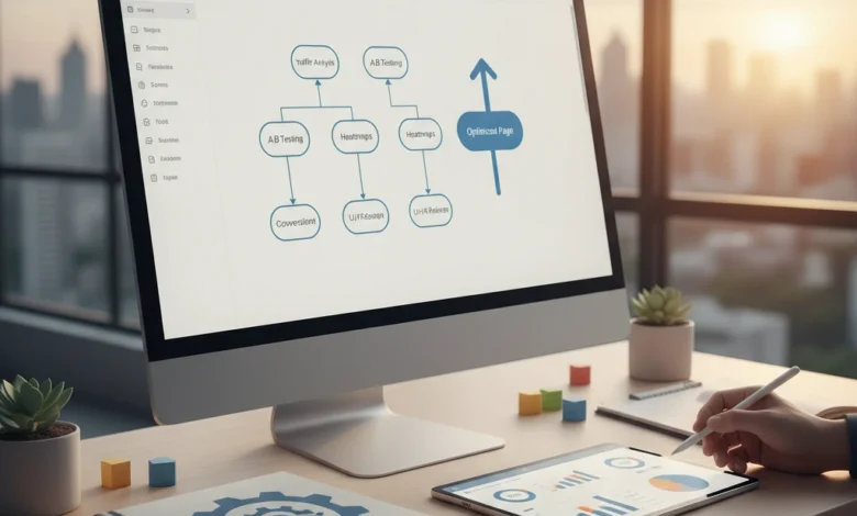
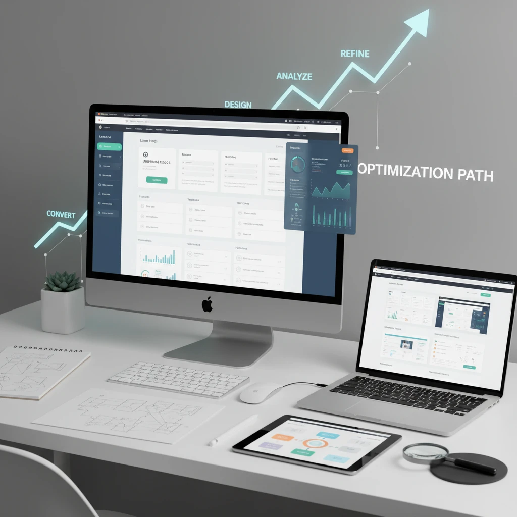
A/B Testing: The Key to Continuous Improvement
A/B testing, also known as split testing, is the cornerstone of landing page optimization. It involves creating two or more versions of a landing page element and showing them to different segments of your audience to determine which performs better. By systematically testing and refining your landing pages, you can incrementally improve your conversion rates over time.
Identifying Key Elements to Test (Headlines, CTAs, Images, etc.)
Knowing what to test is just as important as knowing how to test. Focus on elements that have the biggest impact on user behavior. Here are some key elements to consider:
- Headlines: Test different value propositions, tones, and lengths to see which headline resonates most with your audience. For example, test “Get a Free Consultation” against “Unlock Your Business Potential with Expert Consulting.”
- Call-to-Actions (CTAs): Experiment with different button text, colors, sizes, and placement. A subtle change like “Get Started” versus “Start Your Free Trial Now” can significantly impact conversions.
- Images and Videos: Use high-quality visuals that are relevant to your offer. Test different images to see which ones capture attention and convey the right message. Consider using video to explain complex products or services.
- Form Fields: Reducing the number of form fields can improve conversion rates, but be mindful of the data you need to collect. Test different form field labels and layouts.
- Page Layout: Experiment with different layouts to see which one is most visually appealing and easy to navigate. Consider testing different placements of key elements like headlines, CTAs, and images.
Pitfall: Avoid testing too many elements at once. Testing multiple elements simultaneously makes it difficult to isolate the impact of each change. Focus on testing one element at a time to get clear, actionable results.
Setting Up A/B Tests with Tools like Google Optimize or VWO
Several tools can help you set up and run A/B tests effectively. Google Optimize is a free, powerful option that integrates seamlessly with Google Analytics. VWO (Visual Website Optimizer) is a paid alternative that offers more advanced features like heatmaps and session recordings. Here’s how to get started:
- Choose a Tool: Select an A/B testing tool that meets your needs and budget.
- Define Your Hypothesis: Formulate a clear hypothesis about what you expect to happen when you make a specific change. For example, “Changing the CTA button color from blue to green will increase click-through rates by 10%.”
- Create Variations: Design the different versions of the element you want to test.
- Set Up the Test: Configure the A/B test in your chosen tool, specifying the variations, target audience, and success metrics.
- Run the Test: Let the test run for a sufficient amount of time to gather statistically significant data. Aim for at least 1-2 weeks, or until you reach a predetermined sample size.
Analyzing Test Results and Implementing Winning Variations
Once your A/B test has run long enough to gather sufficient data, it’s time to analyze the results. Look for statistically significant differences between the variations. A statistically significant result means that the difference between the variations is unlikely to be due to chance. Tools like Google Optimize and VWO will typically provide statistical significance data. If a variation performs significantly better than the original, implement the winning variation on your landing page.
Example: You run an A/B test on a landing page for a digital marketing course. Variation A has a headline that reads “Master Digital Marketing Skills” and Variation B has a headline that reads “Become a Digital Marketing Expert in 8 Weeks.” After running the test for two weeks, you find that Variation B has a 15% higher conversion rate with a statistical significance of 95%. You then implement Variation B on your landing page.
Documenting Your Testing Process and Learning From Failures
Maintain a detailed record of all your A/B tests, including the hypothesis, variations, results, and conclusions. This documentation will help you track your progress, identify patterns, and learn from both successes and failures. Even tests that don’t produce significant results can provide valuable insights into your audience’s preferences and behavior. Don’t be afraid to experiment and learn from your mistakes. As mentioned in our guide to digital marketing ROI, consistent testing is critical to sustained improvements.
Beyond A/B Testing: Advanced Optimization Techniques for 2026
While A/B testing is a foundational technique, several advanced optimization strategies can further enhance your landing page performance. These techniques often involve leveraging data and technology to create more personalized and engaging experiences for your visitors.
Personalization: Tailoring Content Based on User Data
Personalization involves tailoring the content of your landing page to match the specific interests and needs of each visitor. This can be achieved by using data such as demographics, location, browsing history, and past purchases to dynamically display different content elements. For example, if a visitor has previously purchased a product from your website, you could show them a related product or offer them a special discount. According to research by McKinsey, personalization can deliver five to eight times ROI on marketing spend and can lift sales by 10% or more. (https://www.mckinsey.com/capabilities/growth-marketing-and-sales/how-we-help-clients/personalized-marketing)
Dynamic Content: Adapting to User Behavior in Real-Time
Dynamic content goes a step further than personalization by adapting to user behavior in real-time. This involves tracking how visitors interact with your landing page and dynamically adjusting the content based on their actions. For example, if a visitor spends a lot of time on a particular section of your page, you could display additional content related to that topic. Or, if a visitor abandons a form, you could offer them a discount or a free trial to encourage them to complete the process. This level of adaptation requires sophisticated tracking and automation capabilities.
AI-Powered Optimization: Using Machine Learning to Improve Conversion Rates
Artificial intelligence (AI) is transforming the landscape of landing page optimization. AI-powered tools can analyze vast amounts of data to identify patterns and predict which variations are most likely to convert. These tools can also automate the A/B testing process, continuously optimizing your landing pages in real-time. For example, an AI-powered tool might automatically adjust the headline, CTA, and images on your landing page based on the visitor’s behavior and preferences. If you want to learn more about AI, check out our article AI-Powered Marketing: A Beginner’s Guide.
Tracking and Analyzing Your Results: Measuring Landing Page Performance
Optimizing your landing pages requires meticulous tracking and analysis. Without accurately measuring your results, you won’t know which changes are effective and which ones are not. By tracking key metrics and analyzing user behavior, you can identify areas for improvement and focus your optimization efforts on the most impactful areas.
Setting Up Conversion Tracking in Google Analytics
Google Analytics is a powerful tool for tracking landing page performance. To get started, you need to set up conversion tracking. This involves defining specific goals that you want visitors to achieve on your landing page, such as filling out a form, making a purchase, or subscribing to a newsletter. Once you’ve defined your goals, you can track how many visitors are completing those goals and calculate your conversion rate. This process involves adding a small piece of code to your landing page that tells Google Analytics when a visitor completes a goal. For instance, you can set up a “thank you” page as a goal destination, triggered upon form submission.
Monitoring Key Metrics: Conversion Rate, Bounce Rate, Time on Page
Several key metrics can provide valuable insights into your landing page performance. These include:
- Conversion Rate: The percentage of visitors who complete a desired action.
- Bounce Rate: The percentage of visitors who leave your landing page without interacting with it.
- Time on Page: The average amount of time that visitors spend on your landing page.
A high conversion rate indicates that your landing page is effectively persuading visitors to take action. A low bounce rate suggests that your landing page is engaging and relevant. A long time on page indicates that visitors are interested in your content. Monitoring these metrics over time can help you identify trends and patterns, and measure the impact of your optimization efforts. If bounce rate is an issue, be sure that web design accessibility is considered.
Identifying Areas for Improvement and Focusing Your Optimization Efforts
By analyzing your tracking data, you can identify areas where your landing page is underperforming. For example, if your bounce rate is high, it may indicate that your landing page is not relevant to the keywords that visitors are searching for. Or, if your conversion rate is low, it may indicate that your CTA is not compelling enough. Once you’ve identified these areas, you can focus your optimization efforts on making changes that will improve those metrics. Consider using tools such as heatmaps and session recordings to get a deeper understanding of how visitors are interacting with your landing page.
Landing Page SEO: Getting Your Page Seen in Search Results
Even the most optimized landing page won’t generate leads if it doesn’t get seen. Search engine optimization (SEO) is essential for driving organic traffic to your landing page. By optimizing your landing page for relevant keywords, you can improve its visibility in search engine results and attract more qualified leads.
Keyword Research: Finding Relevant Keywords for Your Landing Page
Keyword research is the foundation of any successful SEO strategy. It involves identifying the keywords that your target audience is using to search for products or services like yours. Several tools can help you with keyword research, such as Google Keyword Planner, SEMrush, and Ahrefs. When conducting keyword research, focus on finding keywords that are relevant to your offer, have a high search volume, and have low competition. Long-tail keywords (longer, more specific phrases) can also be a great way to attract highly targeted traffic. Our article SEO Keyword Research: A Practical Guide for Beginners provides more details.
On-Page Optimization: Optimizing Your Title Tags, Meta Descriptions, and Header Tags
Once you’ve identified your target keywords, it’s time to optimize your landing page for those keywords. This involves optimizing your title tags, meta descriptions, and header tags. Your title tag is the text that appears in the search engine results page (SERP). It should be concise, descriptive, and include your primary keyword. Your meta description is a brief summary of your landing page that appears below the title tag in the SERP. It should be compelling and encourage users to click through to your landing page. Your header tags (H1, H2, H3, etc.) should be used to structure your content and include relevant keywords. Make sure your H1 tag includes your primary keyword.
Internal Linking: Connecting Your Landing Page to Other Relevant Content on Your Website
Internal linking is the practice of linking from one page on your website to another. This can help improve your landing page’s SEO by distributing link juice and providing context to search engines. When linking to your landing page from other pages on your website, use relevant anchor text that includes your target keywords. For example, if your landing page is about “digital marketing services,” you could link to it from a blog post about “the benefits of digital marketing” using the anchor text “digital marketing services.” Make sure the linked pages are relevant to each other. For instance, if your landing page caters to job seekers, link it with articles discussing resume optimization.
By consistently implementing these strategies – from A/B testing and advanced optimization techniques to meticulous tracking and SEO – you can significantly improve the performance of your landing pages and drive more conversions.
Comments
0 comments