
Last Updated on March 5, 2026 by Prabhakar A
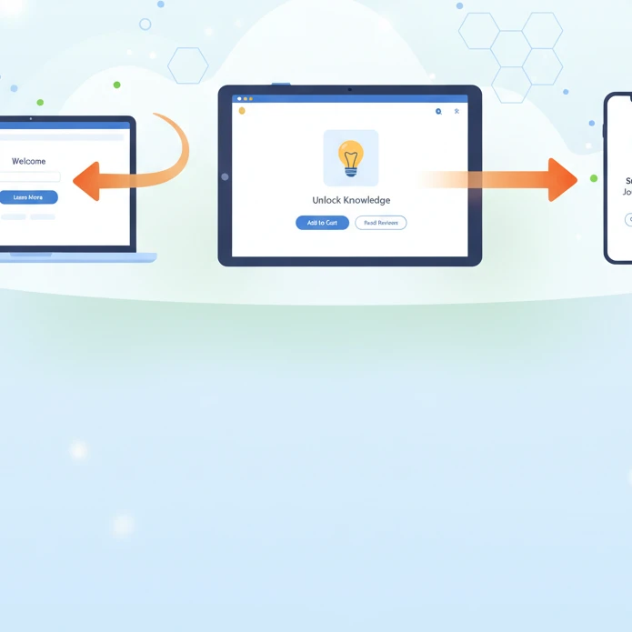
In today’s digital landscape, a website isn’t just a digital brochure; it’s a crucial touchpoint for converting visitors into customers. But are you unintentionally pushing potential clients away with design flaws? Many websites, even with updated designs, leak conversions due to subtle yet significant user experience (UX) issues. This guide will help you identify and address these problems, ensuring your website is a conversion magnet, not a conversion black hole.
This isn’t about fleeting trends; it’s about fundamental principles that drive user behavior and ultimately, your bottom line. We’ll explore common mistakes, discuss the core elements of conversion-focused design, and provide actionable strategies to optimize your website for maximum impact. Let’s dive in and transform your website into a powerful lead-generating machine.
Table of Contents
Is Your Website a Conversion Black Hole? Common Design Mistakes Driving Customers Away (2026 Edition)
Slow Loading Times: The Silent Killer
In the age of instant gratification, slow loading times are a conversion killer. Users expect websites to load almost instantly, and studies show that even a one-second delay can significantly impact conversion rates. According to a 2024 study by Google, 53% of mobile users abandon a site if it takes longer than three seconds to load. Is your website making users wait? Tools like Google’s PageSpeed Insights can help you identify performance bottlenecks. Common causes include unoptimized images, excessive JavaScript, and poor server response times. The fix? Optimize images (compress them without sacrificing quality), minify CSS and JavaScript files, leverage browser caching, and consider upgrading your hosting. Prioritize image formats like WebP for superior compression. Regularly monitor loading speeds – a small investment in performance can yield huge returns. Ignoring this can lead to a frustrated user experience. For example, imagine a user from Trainingsadda.in trying to learn how to secure remote web design jobs but gives up due to the page taking too long to load!
Mobile Unfriendliness: Losing a HUGE Chunk of Traffic
Mobile devices account for a significant portion of website traffic, and if your website isn’t optimized for mobile, you’re essentially turning away a huge segment of potential customers. A responsive design is no longer optional; it’s essential. This means your website should adapt seamlessly to different screen sizes and devices, providing a consistent and user-friendly experience regardless of how users access it. Ensure your site has a mobile-first approach, which includes using a flexible grid layout, large and easily tappable buttons, and a clear and concise navigation menu. Test your website on different devices and screen resolutions to identify any issues. Ignoring mobile optimization can lead to a poor user experience, lower search engine rankings (Google prioritizes mobile-friendly sites), and ultimately, lost conversions. Consider using Accelerated Mobile Pages (AMP) for even faster mobile loading. A mobile-unfriendly experience is especially detrimental to blogs like Trainingsadda.in, where readers are often on the go and accessing content on their smartphones.
Confusing Navigation: The Maze of Lost Customers
Website navigation should be intuitive and easy to use. A confusing or cluttered navigation menu can quickly frustrate users and lead them to abandon your site. Keep your navigation simple, clear, and consistent across all pages. Use descriptive labels for menu items, avoid overwhelming users with too many options, and consider using a search bar to help users find specific information. Implement breadcrumb navigation to help users understand their current location within the site. Conduct user testing to identify any usability issues with your navigation. A/B test different navigation structures to see which performs best. For example, a user coming to Trainingsadda.in to find career guidance should be able to easily navigate to that section from the homepage. Remember: a clear and intuitive navigation system is the key to keeping visitors engaged and guiding them towards conversion.
Understanding Conversion-Focused Design: Beyond Aesthetics
Defining Your Target Audience and Their Needs
Before you can design a website that converts, you need to understand your target audience inside and out. Who are they? What are their pain points? What are their goals? Conduct thorough research to gain insights into their demographics, psychographics, and online behavior. Create detailed user personas to represent your ideal customers. Use surveys, interviews, and analytics data to gather information. Understand their technical proficiency and device preferences. For instance, Trainingsadda.in should consider whether their target audience is primarily students, professionals, or career changers, as their needs and expectations will differ. Are they looking for quick tips or in-depth guides? Tailoring your design to meet the specific needs of your target audience is crucial for driving conversions. Without a solid understanding of your audience, you’re essentially designing in the dark. For example, understanding that the audience is looking for actionable career advice helps prioritize calls to action related to career planning tools or resources.
Setting Clear Conversion Goals: What Do You Want Users to Do?
What specific actions do you want users to take on your website? Do you want them to fill out a form, make a purchase, subscribe to your newsletter, or download a resource? Define clear and measurable conversion goals for each page of your website. Make sure these goals are aligned with your overall business objectives. Use analytics tools like Google Analytics to track your conversion rates and identify areas for improvement. For example, Trainingsadda.in might set a goal of increasing newsletter subscriptions by 20% in the next quarter. Clearly defined conversion goals provide a roadmap for your design efforts and allow you to measure the effectiveness of your changes. Without clear goals, you’re simply hoping for conversions, rather than strategically designing for them. Consider micro-conversions as well, such as time spent on page or number of pages visited, as indicators of engagement.
Mapping the User Journey: From Entry to Conversion
The user journey is the path a user takes from their initial entry point on your website to their eventual conversion. Map out the different steps in this journey, identifying potential roadblocks and opportunities for optimization. Use user flow diagrams to visualize the user journey and identify key touchpoints. Consider different user segments and their respective journeys. For example, a new visitor landing on Trainingsadda.in might start with a blog post, then explore related articles, and finally subscribe to the newsletter. Ensure each step in the journey is seamless and intuitive, guiding users towards the desired conversion goal. Reduce friction by minimizing the number of steps required to complete a conversion. Analyze drop-off points in the user journey to identify areas where users are abandoning the process. Optimizing the user journey is crucial for maximizing conversions and creating a positive user experience. Think about A/B testing different user flows to find the path with the highest conversion rate.
Optimizing Website Layout for Conversions: The Power of Visual Hierarchy
Using the F-Pattern and Z-Pattern for Eye-Catching Placement
Studies have shown that users typically scan web pages in an F-pattern or Z-pattern. The F-pattern is common for text-heavy pages, where users scan the top and left sides of the page, creating a shape resembling the letter “F.” The Z-pattern is more common for pages with less text and more visuals, where users scan the top left, across to the top right, down to the bottom left, and then across to the bottom right, creating a “Z” shape. Utilize these patterns to strategically place key elements on your website, such as headlines, images, and calls to action. Place your most important content along these paths to capture the user’s attention and guide them towards conversion. For example, the Trainingsadda.in website could place its most popular blog posts along the F-pattern to increase visibility and engagement. Be aware of these patterns, but don’t feel constrained by them – user testing is vital. Experiment with different layouts to see what works best for your specific audience and content. Consider cultural differences – reading patterns can vary across cultures.
Strategic Use of White Space: Guiding the User’s Eye
White space, also known as negative space, is the empty space around elements on a web page. It’s a crucial design element that helps to improve readability, reduce clutter, and guide the user’s eye to important content. Use white space generously to create a clean and uncluttered design. Surround key elements, such as calls to action and headlines, with white space to make them stand out. Avoid overcrowding your pages with too much content. A cluttered design can overwhelm users and make it difficult for them to find what they’re looking for. For instance, on Trainingsadda.in, using white space around a call to action to “Download Our Free Career Guide” can significantly increase its visibility and click-through rate. White space isn’t wasted space; it’s a powerful tool for improving usability and driving conversions. Think of it as giving your content room to breathe. Good use of whitespace is an important element to consider for web design tips.
Prioritizing Key Elements: Calls to Action, Value Propositions
Ensure your most important elements, such as calls to action and value propositions, are prominently displayed on your website. Use visual hierarchy to make these elements stand out from the rest of the content. Use larger font sizes, contrasting colors, and strategic placement to draw the user’s attention to these key elements. Your value proposition should clearly communicate the benefits of your product or service. For example, Trainingsadda.in’s value proposition might be: “Learn in-demand skills and advance your career.” Your calls to action should be clear, concise, and action-oriented. For example, “Get Started Now” or “Download Your Free Guide.” Prioritize these elements above the fold, so users see them immediately upon landing on your page. Test different placements and designs to see what performs best. Don’t bury your key elements in a sea of text. Make them visually appealing and easy to find. For instance, if users are trying to boost their business, ensuring they quickly see information about lean principles can be extremely helpful.
Crafting Compelling Calls to Action (CTAs) That Convert
Action-Oriented Language: Verbs that Inspire Action (e.g., “Get Started,” “Download Now”)
Your calls to action (CTAs) should use action-oriented language that inspires users to take the desired action. Use strong verbs that create a sense of urgency and excitement. Examples include: “Get Started,” “Download Now,” “Sign Up Today,” “Learn More,” “Claim Your Discount,” or “Request a Free Quote.” Avoid generic and passive language, such as “Submit” or “Click Here.” Make your CTAs specific and relevant to the context of the page. For example, on a page about web design services, a CTA like “Get a Free Website Audit” would be more effective than a generic “Contact Us” button. Tailor your language to resonate with your target audience. A/B test different CTAs to see which performs best. Use persuasive language that highlights the benefits of taking action. For example, instead of “Download,” try “Download Your Free Ebook and Learn 5 Proven Strategies.” Always think about what your users gain by clicking the CTA. For Trainingsadda.in, a call to action like “Unlock Your Career Potential: Explore Our Career Guides” might be particularly effective.
Placement and Visibility: Above the Fold vs. Below the Fold
The placement of your CTAs is crucial for maximizing conversions. Ideally, your primary CTA should be placed above the fold, so users see it immediately upon landing on your page. However, don’t be afraid to use CTAs below the fold as well, especially for longer pages. Use different types of CTAs depending on their placement. Above the fold, you might use a more prominent and visually appealing CTA to capture the user’s attention. Below the fold, you might use a smaller and less intrusive CTA to remind users of the desired action. Consider using sticky CTAs that remain visible as the user scrolls down the page. A/B test different placements to see what performs best for your specific audience and content. Ensure your CTAs are easy to find and stand out from the rest of the content. For example, if Trainingsadda.in offers a free course, a CTA to “Enroll Now” should be prominently displayed above the fold. Keep in mind the user’s intent at different points on the page; someone who has read the entire article may be more receptive to a direct sales CTA than someone who just landed on the page.
Design Considerations: Button Size, Color, and Contrast
The design of your CTAs plays a significant role in their effectiveness. Use button sizes that are large enough to be easily tappable on mobile devices, but not so large that they overwhelm the page. Choose colors that contrast with the surrounding background to make your CTAs stand out. Use a color that aligns with your brand, but also conveys the desired emotion (e.g., green for “go,” red for “urgent”). Ensure your CTAs are visually appealing and consistent with the overall design of your website. Use clear and legible font sizes. Avoid using too much text on your CTAs. Keep them concise and to the point. Consider using hover effects to provide visual feedback when users interact with your CTAs. A/B test different button designs to see what performs best. For instance, Trainingsadda.in might test a blue button versus an orange button to see which generates more clicks. The goal is to create CTAs that are visually appealing, easy to understand, and impossible to ignore. Remember to maintain a consistent design language across all CTAs on your website. Elementor UI Kits can help streamline this process.
Is Your Website a Conversion Black Hole? Common Design Mistakes Driving Customers Away (2026 Edition)
Slow Loading Times: The Silent Killer
In the fast-paced digital world, slow loading times are a major conversion killer. Users expect websites to load almost instantly, and if your site takes too long, they’ll likely abandon it and go elsewhere. Optimize images and videos to reduce file sizes. Leverage browser caching to store frequently accessed resources locally. Use a content delivery network (CDN) to distribute your website’s content across multiple servers. Minimize HTTP requests by combining CSS and JavaScript files. Consider using lazy loading for images and videos below the fold. Regularly test your website’s loading speed using tools like Google PageSpeed Insights. Aim for a loading time of under three seconds. For Trainingsadda.in, optimizing image sizes on their course pages could significantly improve user experience and reduce bounce rates. Remember, every second counts when it comes to website speed.
Mobile Unfriendliness: Losing a HUGE Chunk of Traffic
With the majority of internet users browsing on mobile devices, having a mobile-unfriendly website is a surefire way to lose potential customers. Ensure your website is responsive and adapts to different screen sizes. Use a mobile-first design approach. Optimize images and videos for mobile devices. Simplify navigation for smaller screens. Use large and easily tappable buttons. Test your website on different mobile devices and browsers. A mobile-unfriendly website can lead to a frustrating user experience and high bounce rates. For Trainingsadda.in, ensuring their online courses are easily accessible and navigable on mobile is crucial. Ignoring mobile users is like ignoring a significant portion of your target audience.
Confusing Navigation: The Maze of Lost Customers
A confusing website navigation can quickly lead to frustrated users and lost conversions. Make sure your website navigation is clear, intuitive, and easy to use. Use a logical menu structure with clear labels. Implement breadcrumbs to help users understand their location on the site. Provide a search bar to allow users to quickly find what they’re looking for. Avoid using too many categories or subcategories. Ensure your navigation is consistent across all pages. A/B test different navigation structures to see what performs best. For Trainingsadda.in, a well-organized course catalog with clear filtering options is essential for helping users find the right courses. A simple and intuitive navigation can significantly improve user experience and increase conversions.
Understanding Conversion-Focused Design: Beyond Aesthetics
Defining Your Target Audience and Their Needs
Before you can design a conversion-focused website, you need to understand your target audience and their needs. Conduct thorough market research to identify your ideal customers. Create buyer personas to represent your target audience. Understand their pain points, motivations, and goals. Tailor your website’s content and design to address their specific needs and interests. Use language that resonates with your target audience. For Trainingsadda.in, understanding the specific skills and career goals of their target learners is crucial for crafting compelling course descriptions and marketing messages. Knowing your audience is the foundation of effective conversion-focused design.
Setting Clear Conversion Goals: What Do You Want Users to Do?
Defining clear conversion goals is essential for measuring the success of your website design. What do you want users to do when they visit your site? Do you want them to sign up for a newsletter, request a demo, purchase a product, or contact you for more information? Set specific, measurable, achievable, relevant, and time-bound (SMART) goals. Track your conversion rates and identify areas for improvement. Ensure your website design supports your conversion goals. For Trainingsadda.in, a primary conversion goal might be to increase course enrollments. All design decisions should be aligned with achieving this goal. Without clear goals, you’re designing in the dark.
Mapping the User Journey: From Entry to Conversion
Mapping the user journey involves understanding the steps users take from their initial entry point on your website to the final conversion. Identify potential friction points and areas for improvement. Analyze user behavior using tools like Google Analytics. Optimize each step of the user journey to make it as smooth and seamless as possible. Consider using heatmaps and session recordings to gain insights into user behavior. For Trainingsadda.in, mapping the user journey might involve analyzing how users navigate from the homepage to a specific course page and then to the enrollment process. A well-optimized user journey can significantly increase conversion rates.
Optimizing Website Layout for Conversions: The Power of Visual Hierarchy
Using the F-Pattern and Z-Pattern for Eye-Catching Placement
The F-pattern and Z-pattern are common reading patterns that can be used to optimize website layout. The F-pattern is typically used for text-heavy pages, where users scan the top and left side of the content. The Z-pattern is used for pages with fewer text and more visual elements. Place important elements, such as your logo, headline, and call to action, along these patterns. Use visual cues, such as arrows and lines, to guide the user’s eye. A/B test different layouts to see what performs best for your specific content. For Trainingsadda.in, placing key information about their courses along the F-pattern or Z-pattern could improve user engagement. Understanding these patterns can help you strategically place content to maximize impact.
Strategic Use of White Space: Guiding the User’s Eye
White space, also known as negative space, is the empty area around elements on a page. It’s crucial for creating a clean and uncluttered design. Use white space to separate elements and improve readability. Avoid crowding elements together, as this can overwhelm the user. White space can also be used to draw attention to specific elements, such as your call to action. For Trainingsadda.in, using white space around their course titles and descriptions can make them more visually appealing and easier to read. Don’t be afraid to use white space; it’s a powerful design tool.
Prioritizing Key Elements: Calls to Action, Value Propositions
Prioritize key elements, such as your calls to action and value propositions, to ensure they stand out from the rest of the content. Use visual hierarchy to emphasize these elements. Make them larger, bolder, and more visually appealing than other elements on the page. Place them in prominent locations, such as above the fold or in the center of the page. Use contrasting colors to make them stand out. For Trainingsadda.in, their value proposition (e.g., “Learn in-demand skills”) and calls to action (e.g., “Enroll Now”) should be prominently displayed on their website. By prioritizing key elements, you can guide users towards the desired action.
Crafting Compelling Calls to Action (CTAs) That Convert
Action-Oriented Language: Verbs that Inspire Action (e.g., “Get Started,” “Download Now”)
Use action-oriented language in your CTAs to inspire users to take action. Start your CTAs with strong verbs that convey a sense of urgency and excitement. Use words like “Get,” “Download,” “Start,” “Join,” “Learn,” and “Discover.” Avoid using generic and passive language. For example, instead of “Submit,” use “Send Your Application.” Instead of “More Information,” use “Learn More.” For Trainingsadda.in, CTAs like “Start Learning Today” or “Enroll Now and Advance Your Career” are more compelling than generic phrases. The right words can make all the difference in converting visitors into customers.
The placement and visibility of your CTAs are crucial. Above the fold (the portion of the webpage visible without scrolling) is often considered prime real estate for important CTAs. However, don’t neglect below-the-fold placement. Consider the user’s journey. A user who has scrolled down the page is more engaged and may be more receptive to a CTA at the end of the content. Experiment with different placements to see what works best. For Trainingsadda.in, placing a “Browse Courses” CTA above the fold and a “Enroll Now” CTA at the end of a course description could be effective. Test different placements to optimize conversion rates.
Design Considerations: Button Size, Color, and Contrast
The design of your CTA buttons plays a significant role in their effectiveness. Ensure your buttons are large enough to be easily clickable, especially on mobile devices. Use colors that contrast with the background to make them stand out. Consider using a color that is consistent with your brand but also visually appealing. For Trainingsadda.in, using a bright, contrasting color for their “Enroll Now” buttons could attract more attention. A/B test different button sizes, colors, and text to see what resonates best with your audience. Small design tweaks can lead to significant improvements in conversion rates.
Is Your Website a Conversion Black Hole? Common Design Mistakes Driving Customers Away (2026 Edition)
Slow Loading Times: The Silent Killer
In today’s fast-paced digital world, slow loading times can be a death sentence for your website’s conversion rates. Users expect websites to load quickly, and they’re unlikely to wait around for a slow-loading page. Optimize your images, leverage browser caching, and minimize HTTP requests to improve loading times. Use tools like Google PageSpeed Insights to identify and fix performance bottlenecks. For Trainingsadda.in, optimizing their website’s loading speed can significantly reduce bounce rates and increase conversions. A few seconds can make all the difference.
Mobile Unfriendliness: Losing a HUGE Chunk of Traffic
With the majority of internet users now accessing websites on mobile devices, having a mobile-friendly website is no longer optional; it’s essential. Ensure your website is responsive and adapts to different screen sizes. Use a mobile-first approach to design, prioritizing the mobile experience. Optimize images for mobile devices and avoid using Flash, which is not supported on many mobile devices. For Trainingsadda.in, a mobile-friendly website is crucial for reaching a wider audience and converting mobile users into paying customers. A responsive design ensures a seamless experience across all devices.
Confusing Navigation: The Maze of Lost Customers
A confusing website navigation can frustrate users and drive them away. Ensure your website has a clear and intuitive navigation structure. Use descriptive labels for your menu items and make it easy for users to find what they’re looking for. Implement a search function to allow users to quickly search for specific content. Use breadcrumbs to help users understand their location on the website. For Trainingsadda.in, a well-organized navigation menu that clearly categorizes their courses can greatly improve user experience and increase engagement. Make it easy for users to find what they need and they’ll be more likely to convert.
Leveraging Social Proof to Build Trust and Boost Conversions
Social proof is a psychological phenomenon where people assume the actions of others reflect correct behavior for a specific situation. In web design, strategically showcasing social proof elements can significantly increase trust and, consequently, conversion rates. However, it’s crucial to present this information authentically. Fake or misleading social proof can severely damage your brand’s reputation. Think beyond simple numbers; focus on demonstrating genuine satisfaction and value. For example, avoid vague testimonials and instead opt for detailed accounts with specific benefits mentioned.
Testimonials: Real Stories from Satisfied Customers
Testimonials are powerful tools for showcasing the positive experiences of your customers. To maximize their impact, ensure they are authentic and specific. Include the customer’s full name, a photo (with their permission, of course), and details about their experience with your product or service. Vague testimonials like “Great product!” are less effective than those that highlight specific benefits, such as “Trainingsadda.in’s digital marketing guide helped me increase my website traffic by 30% in just two months!”. Video testimonials can be even more compelling. Consider using a tool to verify the authenticity of testimonials to build more trust.
Case Studies: Demonstrating Value with Concrete Results
Case studies provide in-depth narratives of how your product or service has helped customers achieve specific goals. Unlike testimonials, case studies offer a more detailed analysis of the problem, the solution implemented, and the results achieved. When creating a case study, focus on quantifiable metrics and tangible outcomes. For example, instead of saying “Our client saw improved sales,” state “Our client increased their sales by 45% within six months of implementing our recommended SEO strategies, resulting in a $20,000 increase in revenue.” Case studies are particularly effective for B2B websites or products that require a higher level of investment. A/B test different case study formats to see what resonates best with your audience.
Trust Badges and Certifications: Showing Credibility and Security
Trust badges and certifications are visual indicators that demonstrate your website’s security and credibility. These badges can include SSL certificates, security certifications (like PCI DSS for e-commerce sites), and affiliations with reputable organizations. Display these badges prominently on your website, particularly on checkout pages and anywhere users are asked to provide sensitive information. Ensure the badges are clickable and link to the certification provider’s website for verification. Using recognizable and reputable badges, like a verified McAfee Secure badge, instantly reassures visitors about the safety of their data. A potential pitfall is displaying outdated or irrelevant badges, which can actually erode trust. Regularly review and update your certifications to maintain credibility.
Mobile-First Design: Ensuring Seamless Conversions on Any Device
With the majority of web traffic now originating from mobile devices, a mobile-first design approach is crucial for maximizing conversions. Mobile-first design means prioritizing the mobile experience and then progressively enhancing it for larger screens. This ensures that your website is not only visually appealing on mobile devices but also functional and user-friendly. Neglecting mobile optimization can lead to high bounce rates, poor user engagement, and ultimately, lost conversions. Ensure your mobile experience is faster than your desktop, or risk losing impatient visitors.
Responsive Design Principles: Adapting to Different Screen Sizes
Responsive design is a web design approach that aims to provide an optimal viewing experience across a wide range of devices, from smartphones and tablets to laptops and desktop computers. This is achieved through flexible layouts, images, and CSS media queries that adapt to different screen sizes and orientations. When implementing responsive design, consider using a CSS framework like Bootstrap or Foundation, which provide pre-built components and grid systems that simplify the process. Thoroughly test your website on various devices and browsers to ensure consistent performance and appearance. A common mistake is assuming that a website looks good on one mobile device, it will look good on all. Invest in cross-device testing tools to prevent issues.
Touch-Friendly Navigation: Making it Easy to Interact on Mobile
Touch-friendly navigation is essential for creating a positive user experience on mobile devices. This involves designing elements that are easy to tap and interact with using a finger or thumb. Avoid small, closely spaced links and buttons that can be difficult to click accurately. Use larger fonts and clear visual cues to guide users through your website. Implement a mobile-friendly menu that is easy to access and navigate. Consider using a hamburger menu or a bottom navigation bar for quick access to key sections of your website. Ensure that interactive elements, such as forms, are optimized for touch input. Avoid using hover states for displaying additional information, as these are not supported on touch screens. Prioritize a clean and uncluttered interface to minimize distractions and maximize usability. See Web Design Tips: Creating a User-Friendly Website for more information.
Optimizing Images and Videos for Mobile Performance
Large images and videos can significantly slow down your website’s loading speed, particularly on mobile devices with limited bandwidth. To optimize images for mobile performance, compress them using tools like TinyPNG or ImageOptim. Choose the appropriate image format (JPEG for photos, PNG for graphics) and resize images to the dimensions they will be displayed on the screen. For videos, consider using a video hosting platform like YouTube or Vimeo to reduce the load on your server. Use adaptive streaming to deliver different video qualities based on the user’s internet connection. Lazy loading images can also help improve performance by only loading images that are visible in the viewport. Prioritize the mobile experience to enhance user experience.
Website Speed Optimization: Delivering a Fast and Fluid User Experience
Website speed is a critical factor in determining user engagement and conversion rates. A slow-loading website can lead to frustrated users, higher bounce rates, and lower search engine rankings. Optimizing your website’s speed is essential for providing a positive user experience and maximizing conversions. Google’s PageSpeed Insights is a valuable tool for analyzing your website’s performance and identifying areas for improvement. Aim for a load time of under three seconds for optimal results.
Image Compression: Reducing File Sizes Without Sacrificing Quality
Image compression is the process of reducing the file size of images without significantly compromising their visual quality. There are two main types of image compression: lossy and lossless. Lossy compression reduces file size by discarding some image data, while lossless compression preserves all image data. For web images, it’s often acceptable to use lossy compression to achieve significant file size reductions. Tools like TinyPNG and ImageOptim can automatically compress images without noticeable quality loss. Experiment with different compression levels to find the optimal balance between file size and visual quality. Consider using WebP image format, which offers superior compression compared to JPEG and PNG. A mistake to avoid is compressing already small images, as this can introduce artifacts without significant gains.
Caching Strategies: Storing Static Content for Faster Delivery
Caching is a technique that involves storing static content, such as images, CSS files, and JavaScript files, on the user’s browser or on a server-side cache. This allows the browser to retrieve the content from the cache instead of downloading it from the server every time the user visits the website. Caching can significantly improve website loading speed and reduce server load. Implement browser caching by setting appropriate HTTP headers in your server configuration. Use a content delivery network (CDN) to distribute your website’s static assets across multiple servers around the world. This ensures that users can access your website from a server that is geographically close to them, reducing latency and improving loading speed. A misconfiguration of cache settings could potentially serve old files and break parts of your website. Regularly clear your cache as part of website maintenance.
Minifying Code: Removing Unnecessary Characters from HTML, CSS, and JavaScript
Minifying code involves removing unnecessary characters, such as whitespace, comments, and line breaks, from your HTML, CSS, and JavaScript files. This reduces the file size of your code, making it faster to download and parse by the browser. There are many online tools and build processes that can automatically minify your code. Be cautious when minifying heavily commented code, as you may lose valuable context for future debugging. Always keep a backup of your original, unminified code in case you need to make changes or revert to a previous version. Some minification tools can also obfuscate your code, making it more difficult for others to understand and copy. Consider using a combination of minification and gzipping for optimal results. You might also like to consider using a UI kit to create fast web pages.
A/B Testing for Conversions: Data-Driven Design Improvements
A/B testing, also known as split testing, is a method of comparing two versions of a web page or element to determine which one performs better. By A/B testing different design elements, you can make data-driven decisions to optimize your website for conversions. This involves creating two versions (A and B) of a page, element, or feature. Version A is the control version, while Version B is the variation you want to test. Users are randomly assigned to see either version A or version B, and the performance of each version is tracked. Analyze the results to determine which version performed better based on your chosen metrics (e.g., conversion rate, click-through rate, bounce rate). Implement the winning variation on your website to improve conversions. Never stop testing! Continuous optimization is key to maximizing conversions.
Identifying Key Areas for Testing: Headlines, CTAs, Images
When conducting A/B tests, it’s important to focus on key areas that have the greatest impact on conversions. Some of the most common elements to test include headlines, calls to action (CTAs), images, form fields, and page layouts. Headlines are often the first thing visitors see, so testing different headline variations can significantly impact engagement and conversion rates. Test different CTA text, colors, and placement to see which combinations drive the most clicks. Experiment with different images to see which ones resonate best with your target audience. Simplify form fields and test different layouts to improve form completion rates. Consider testing different landing page layouts to optimize the user experience and guide visitors towards conversion goals. Start by testing elements that are most likely to impact conversion rates. Avoid making too many changes at once. It is also useful to remember Boost Your Business: A Guide to Lean Principles, as some ideas and approaches can be applied to web design.
Setting Up A/B Tests: Tools and Best Practices
There are several tools available for setting up A/B tests, including Google Optimize, Optimizely, and VWO. These tools allow you to create variations of your web pages, track user behavior, and analyze the results. When setting up an A/B test, it’s important to define a clear hypothesis, choose a representative sample size, and run the test for a sufficient duration. A clear hypothesis will help you understand why one version might perform better than the other. Ensure your sample size is large enough to achieve statistically significant results. Run the test for at least one or two weeks to account for variations in traffic patterns and user behavior. Avoid making changes to your website during the testing period to prevent confounding results. For reliable results, consult with a statistician.
Analyzing Results and Implementing Winning Variations
Once your A/B test has run for a sufficient duration, it’s time to analyze the results and determine which version performed better. Look at the key metrics you defined before running the test, such as conversion rate, click-through rate, and bounce rate. Use statistical significance to determine whether the difference in performance between the two versions is statistically significant or simply due to random chance. If the results are statistically significant, implement the winning variation on your website. It’s important to document your testing process and results to build a knowledge base for future optimization efforts. After implementing the winning variation, monitor its performance to ensure that it continues to deliver the desired results. A/B testing is an iterative process, so continue testing and refining your website to maximize conversions over time.
Website Security: Earning Customer Trust Through Safe Browsing (HTTPS & SSL)
In today’s digital landscape, website security is paramount. Users are increasingly aware of online threats and expect websites to protect their data. Implementing HTTPS and SSL certificates is no longer optional; it’s a fundamental requirement for building trust and fostering conversions. Without these measures, browsers will often display warnings to users, deterring them from interacting with your site. Choosing an appropriate SSL certificate (e.g., Domain Validated, Organization Validated, or Extended Validation) depends on the level of assurance you want to provide to your users. A critical decision factor is the type of data being transmitted; sensitive data requires higher levels of validation. Neglecting SSL can lead to data breaches, reputational damage, and a significant drop in user engagement. Conversely, a secure website demonstrates your commitment to user privacy and data protection, boosting confidence and encouraging conversions.
Understanding SSL Certificates and HTTPS Encryption
SSL (Secure Sockets Layer) certificates are digital certificates that authenticate a website’s identity and enable an encrypted connection. HTTPS (Hypertext Transfer Protocol Secure) is the secure version of HTTP, the protocol over which data is sent between your browser and the website you are connected to. HTTPS encryption is enabled by SSL certificates. When a user visits a website secured with HTTPS, their browser verifies the website’s SSL certificate with a trusted Certificate Authority (CA). If the certificate is valid, a secure connection is established, encrypting all data transmitted between the user’s browser and the website’s server. This prevents eavesdropping and tampering by malicious actors. Decision criteria for selecting an SSL certificate include: validation level, warranty, and browser compatibility. Pitfalls to avoid include: using self-signed certificates (which are not trusted by browsers) and failing to renew certificates before they expire.
Displaying Security Badges Prominently
Visually reinforcing your website’s security measures is crucial for building user trust. Security badges, such as those from trusted security providers like DigiCert or Norton, can be strategically placed on your website, particularly in areas where users are entering sensitive information, such as login pages, registration forms, and checkout pages. These badges serve as visual cues that your website is taking security seriously. Ensure that the badges are clickable and lead to a verification page from the security provider. Key criteria include: badge recognition and relevance to your target audience. A common pitfall is displaying outdated or fake security badges, which can erode trust. A/B test badge placement to optimize for click-through rates and conversion improvements. It is also worth considering third-party reviews about security to further reinforce trust.
Regular Security Audits and Updates
Maintaining a secure website is an ongoing process that requires regular security audits and updates. Vulnerabilities are constantly being discovered, and it’s essential to proactively identify and address any weaknesses in your website’s security posture. Conduct regular vulnerability scans using tools like OWASP ZAP and consider hiring a professional security firm to perform penetration testing. Keep your website’s software, including your content management system (CMS), plugins, and themes, up to date with the latest security patches. Implement a web application firewall (WAF) to protect against common web attacks. Decision criteria include: the frequency and scope of audits, the responsiveness of your development team to security vulnerabilities, and the effectiveness of your security tools. A pitfall to avoid is neglecting security updates, which can leave your website vulnerable to attack.
Conversion-Friendly Forms: Making it Easy for Users to Provide Information
Forms are a critical touchpoint in the conversion process. Whether it’s a contact form, a signup form, or a checkout form, the user experience directly impacts conversion rates. A poorly designed form can lead to frustration, abandonment, and lost opportunities. The goal is to create a form that is intuitive, easy to complete, and respectful of the user’s time. Prioritize user experience by minimizing friction and providing clear guidance. A lengthy and confusing form can deter users, while a well-designed form can encourage them to take the desired action. Consider implementing features like auto-completion, progress indicators, and mobile responsiveness to enhance the user experience. Regularly analyze form analytics to identify areas for improvement and optimize for higher conversion rates. For example, if you are offering career guidance through your platform, the forms should be especially accessible and easy to use.
Minimizing Form Fields: Only Ask for Essential Information
One of the most effective ways to improve form conversion rates is to minimize the number of fields. Only ask for information that is absolutely essential for your business goals. Each additional field adds friction and increases the likelihood of abandonment. Prioritize essential data points and eliminate unnecessary fields. Consider using progressive profiling to gather additional information over time, rather than asking for everything upfront. For example, for initial contact, you might only require name and email address, and then collect additional information later as the user interacts with your website. Decision criteria for including a form field should include its impact on conversions. A/B testing different form field configurations can help identify the optimal balance between data collection and user experience. A common pitfall is asking for too much information upfront, which can deter users from completing the form.
Clear and Concise Labeling: Guiding Users Through the Form
Clear and concise labeling is essential for guiding users through the form and ensuring that they understand what information is being requested. Use descriptive labels that accurately reflect the purpose of each field. Avoid jargon or technical terms that may confuse users. Position labels above or to the left of the corresponding fields for easy readability. Use placeholder text within the fields to provide examples of the expected input format. Provide clear instructions for any fields that require specific formatting or input. Decision criteria include: clarity and accessibility. Common pitfalls include: using ambiguous labels, relying solely on placeholder text (which disappears when the user starts typing), and failing to provide sufficient context. For example, instead of labeling a field “Address,” use “Street Address (Line 1)”.
Error Handling: Providing Helpful Feedback and Guidance
Effective error handling is crucial for guiding users through the form and preventing frustration. When a user makes a mistake, provide clear and helpful error messages that explain the problem and offer guidance on how to fix it. Display error messages inline, near the corresponding field, rather than at the top or bottom of the form. Use visual cues, such as color-coding, to highlight fields with errors. Provide real-time validation to catch errors as the user types, rather than waiting until they submit the form. Decision criteria for error messages include: clarity, specificity, and helpfulness. A common pitfall is displaying generic error messages that don’t provide enough information to guide the user. Example: Instead of “Invalid Input,” use “Please enter a valid email address in the format name@example.com.”
Analyzing Conversion Rates: Using Data to Continuously Improve Your Design
Web design isn’t a one-time task; it’s an ongoing process of iteration and optimization. Analyzing conversion rates and other key metrics is essential for understanding how users are interacting with your website and identifying areas for improvement. By tracking these metrics, you can gain valuable insights into user behavior, identify pain points, and make data-driven decisions to optimize your design for higher conversion rates. This approach aligns with the principles of continuous improvement, ensuring that your website is constantly evolving to meet the needs of your users and achieve your business goals. Continuous monitoring of key performance indicators allows you to respond dynamically to shifts in user behavior and trends. For example, if you are helping businesses grow with principles discussed in articles like Boost Your Business: A Guide to Lean Principles, analyze how users engage with these guides.
Tracking Key Metrics: Bounce Rate, Time on Page, Conversion Rate
Several key metrics can provide valuable insights into your website’s performance. Bounce rate measures the percentage of visitors who leave your website after viewing only one page. A high bounce rate may indicate that your landing pages are not relevant to user search queries or that your website’s design is not engaging. Time on page measures the average amount of time visitors spend on a particular page. A low time on page may indicate that the content is not interesting or that the page is difficult to read. Conversion rate measures the percentage of visitors who complete a desired action, such as filling out a form, making a purchase, or signing up for a newsletter. Tracking these metrics over time can help you identify trends and patterns, as well as the impact of design changes on user behavior.
Using Analytics Tools: Google Analytics, Hotjar
Several analytics tools can help you track and analyze your website’s performance. Google Analytics is a free and powerful tool that provides a wealth of data about user behavior, including bounce rate, time on page, conversion rate, and traffic sources. Hotjar is another popular tool that offers heatmaps, session recordings, and feedback polls. Heatmaps visually represent where users are clicking, scrolling, and moving their mouse on your website, providing insights into user engagement. Session recordings allow you to watch real users interact with your website, revealing usability issues and areas of frustration. Feedback polls allow you to directly solicit feedback from users about their experience on your website. By combining data from these tools, you can gain a comprehensive understanding of user behavior and identify opportunities for optimization. Content marketing also allows businesses to create content based around analytics to improve user engagement.
Identifying Areas for Improvement Based on Data
Once you have collected data using analytics tools, the next step is to analyze the data and identify areas for improvement. Look for patterns and trends that indicate pain points or areas of friction in the user experience. For example, if you notice a high bounce rate on a particular landing page, you may need to revise the content or design to make it more relevant to user search queries. If you see that users are spending a lot of time on a particular form field, you may need to simplify the field or provide clearer instructions. Use A/B testing to compare different design options and determine which ones lead to higher conversion rates. Continuously monitor your key metrics and iterate on your design based on the data.
By prioritizing website security, optimizing forms for ease of use, and continuously analyzing conversion data, you can create a website that not only attracts visitors but also converts them into valuable customers. Remember that web design is an iterative process, and continuous improvement is key to achieving long-term success.
Comments
0 comments